


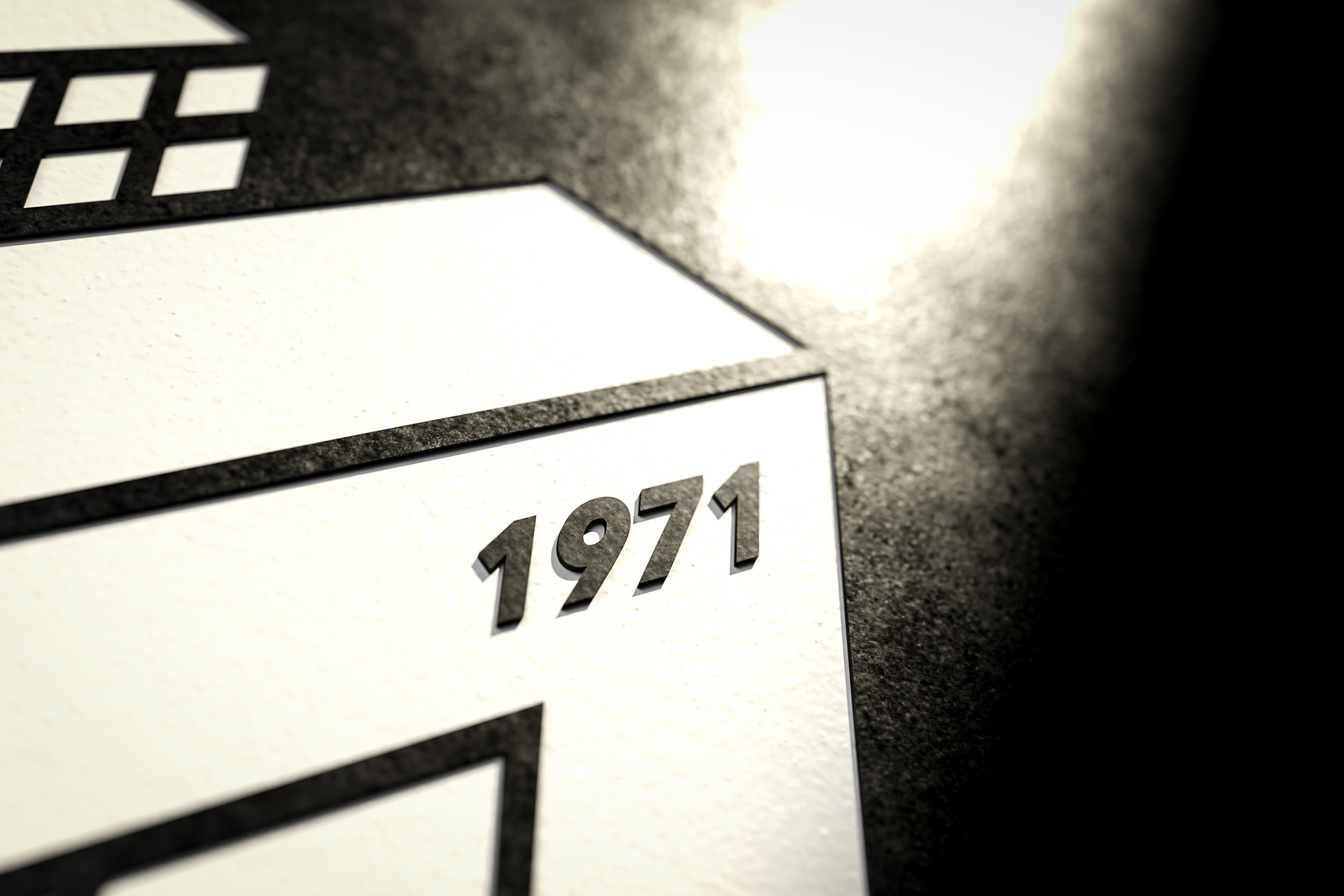

Rooted in tradition since 1971, MORTHANOS has served as a cornerstone in the world of building materials, industrial tools, paints, and insulation products. For the redesign of its brand identity, the objective was clear: to capture the enduring strength and structured expertise that defines MORTHANOS, while projecting a bold, architectural confidence into the future.
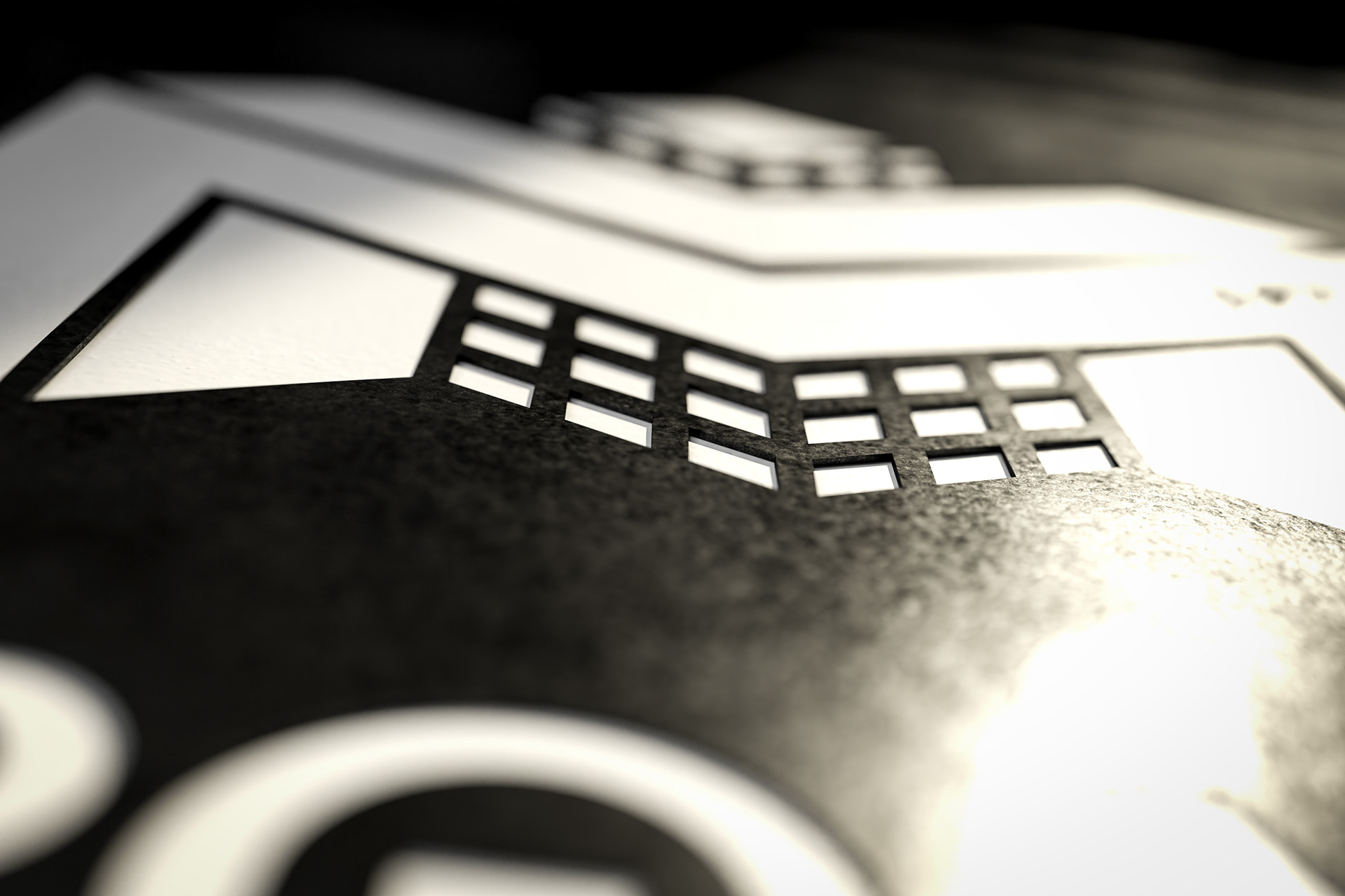
The new logo is an emblem of solidity and precision. A monolithic “M” structure, inspired by modernist architecture and the modular organization of construction elements, stands as the centerpiece. The use of geometric forms and a strong three-dimensional perspective conveys the feeling of robustness, trust, and technical know-how — essential qualities for a company supplying construction and building solutions.
The monochromatic color palette enhances the sense of professionalism and timelessness. Sharp shadows and light contrasts were deliberately introduced in the visual presentation, creating an atmosphere of industrial sophistication, highlighting the materials’ raw and authentic nature.
Typography was chosen to reinforce the brand’s technical spirit: clean, bold, and without unnecessary ornamentation, with subtle customizations to reflect craftsmanship and attention to detail. Supporting descriptors were added in a minimalistic and aligned system, clearly communicating the store’s three major sectors.
This identity system is flexible yet distinct — adaptable for signage, packaging, catalogs, and digital presence — securing MORTHANOS’ place as a leading technical hub, proudly rooted in its heritage while dynamically facing the challenges of tomorrow.