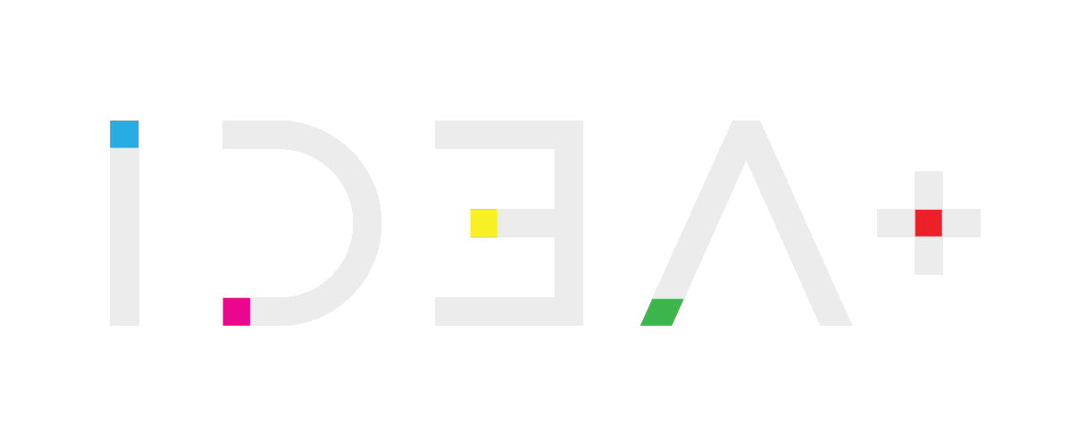
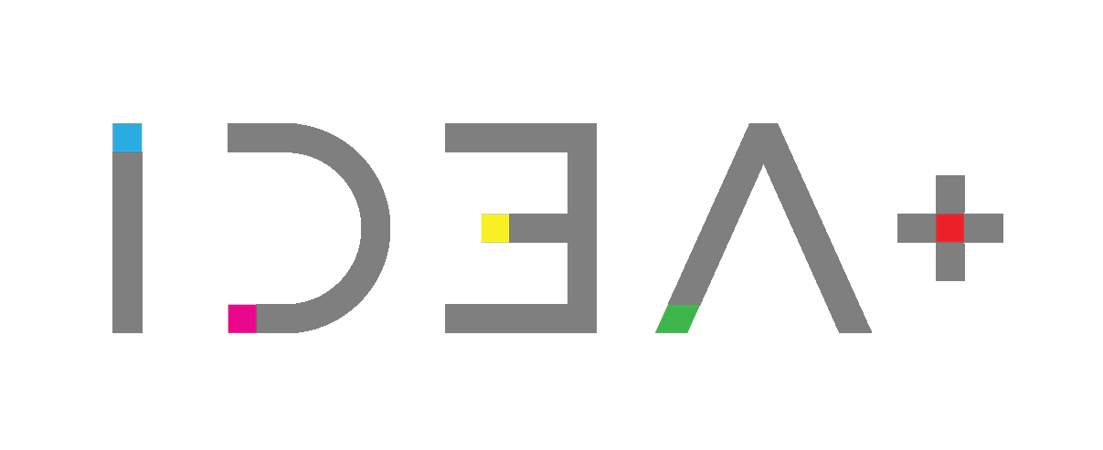

Design: New Logo.
Client: FORMA®.
Location: Thessaloniki / Hellas.
Date: February 2025.
Client: FORMA®.
Location: Thessaloniki / Hellas.
Date: February 2025.
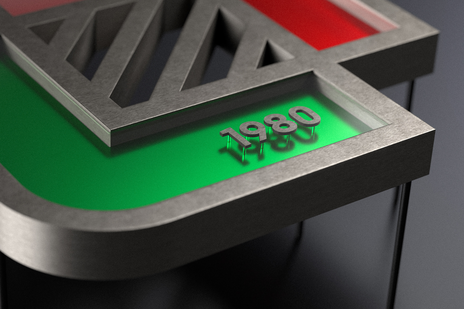
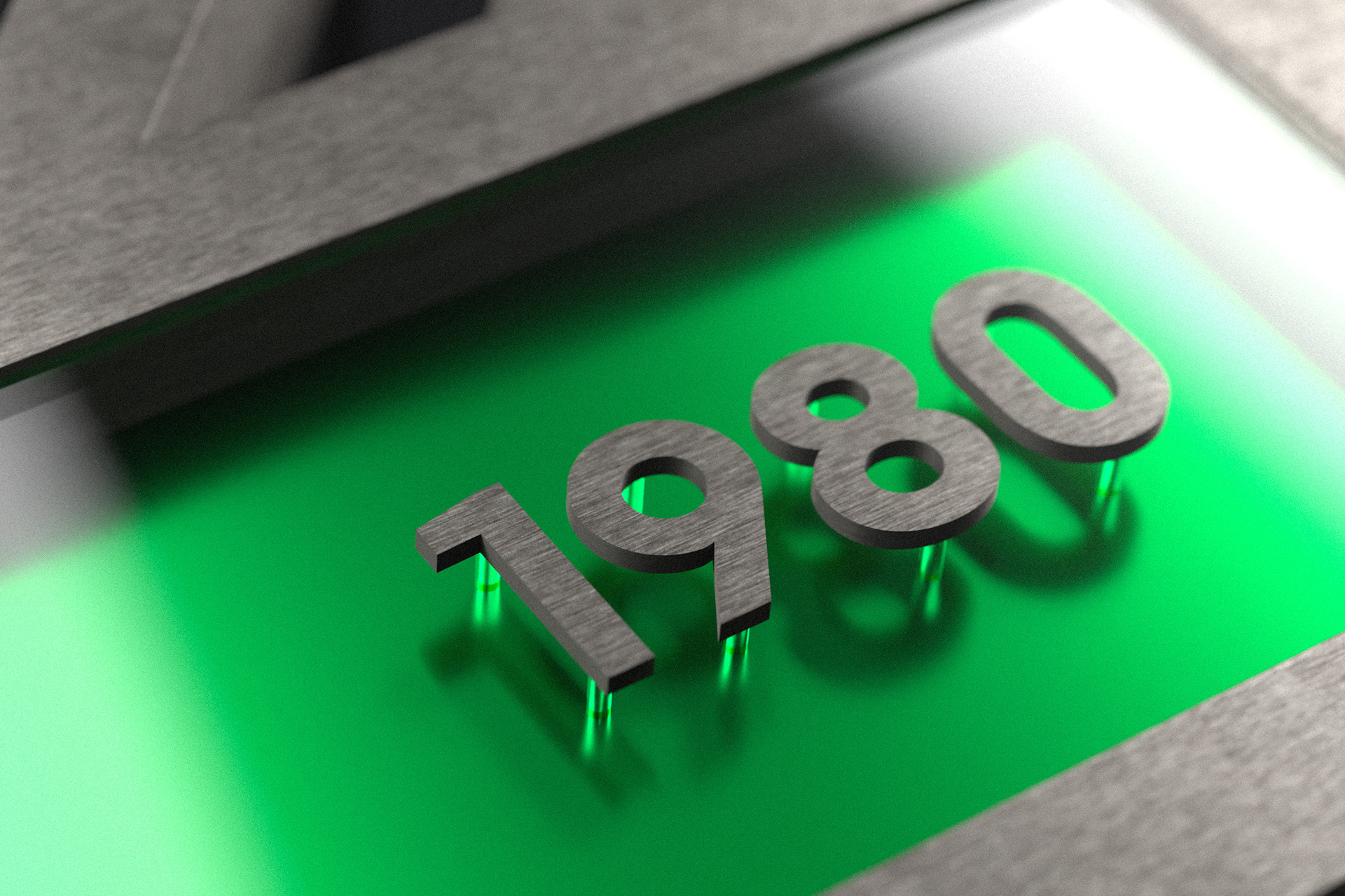
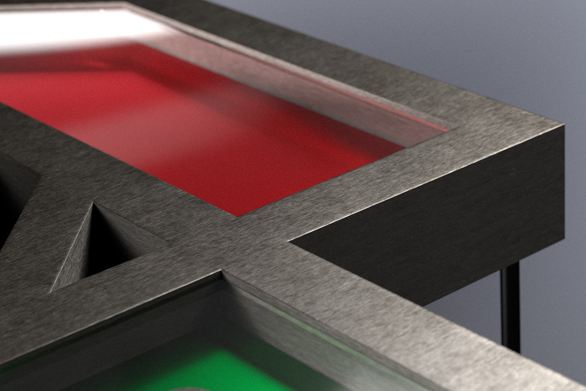
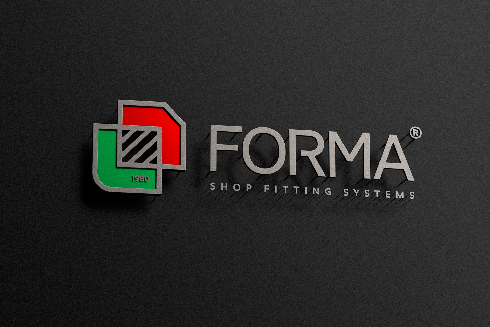
The new logo for FORMA® was developed as a geometric emblem with architectural clarity and industrial precision. The overlapping red and green volumes represent structure and adaptability, while the metallic frame expresses strength and durability. The integration of 1980 highlights the company’s heritage and continuity.
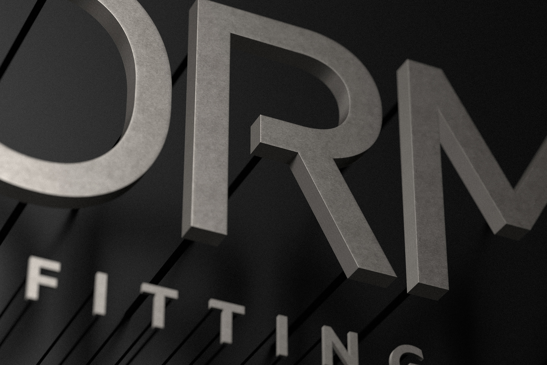
The custom typography follows a clean and balanced style, consistent with the technical identity of the brand. This identity reflects reliability, modernity, and the structural essence of shop fitting systems.
Το νέο λογότυπο της FORMA® αναπτύχθηκε ως γεωμετρικό έμβλημα με αρχιτεκτονική καθαρότητα και βιομηχανική ακρίβεια. Οι επικαλυπτόμενοι όγκοι σε κόκκινο και πράσινο συμβολίζουν τη δομή και την προσαρμοστικότητα, ενώ το μεταλλικό πλαίσιο εκφράζει δύναμη και ανθεκτικότητα. Η ενσωμάτωση του 1980 αναδεικνύει την κληρονομιά και τη συνέχεια της εταιρείας.
Η προσαρμοσμένη τυπογραφία ακολουθεί καθαρό και ισορροπημένο ύφος, εναρμονισμένο με την τεχνική ταυτότητα του brand. Η ταυτότητα αυτή αποτυπώνει την αξιοπιστία, τη σύγχρονη προσέγγιση και την δομική ουσία των shop fitting systems.
#design #logo #branding #id3a #hellenicdesign #shopfittingsystems