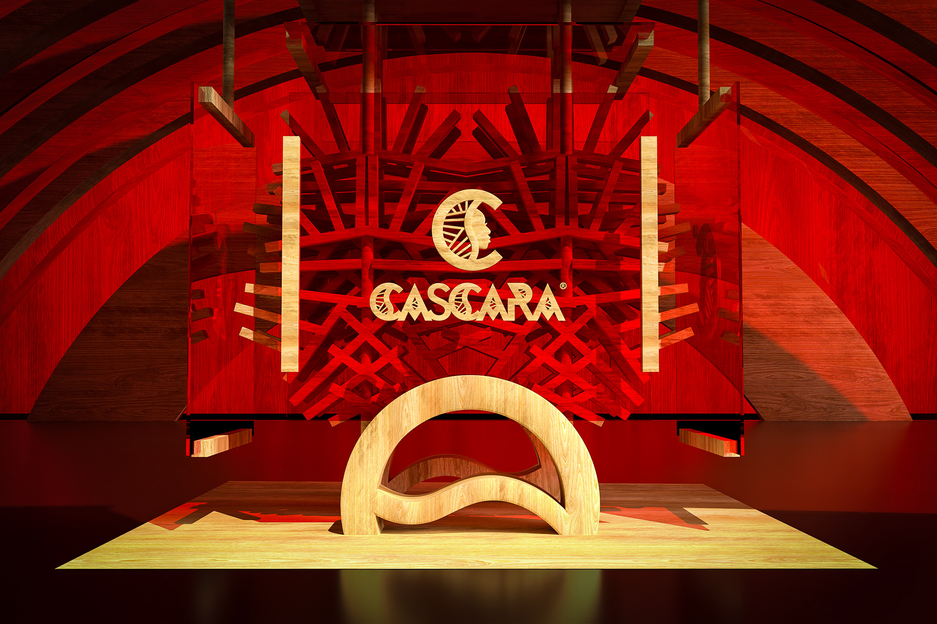
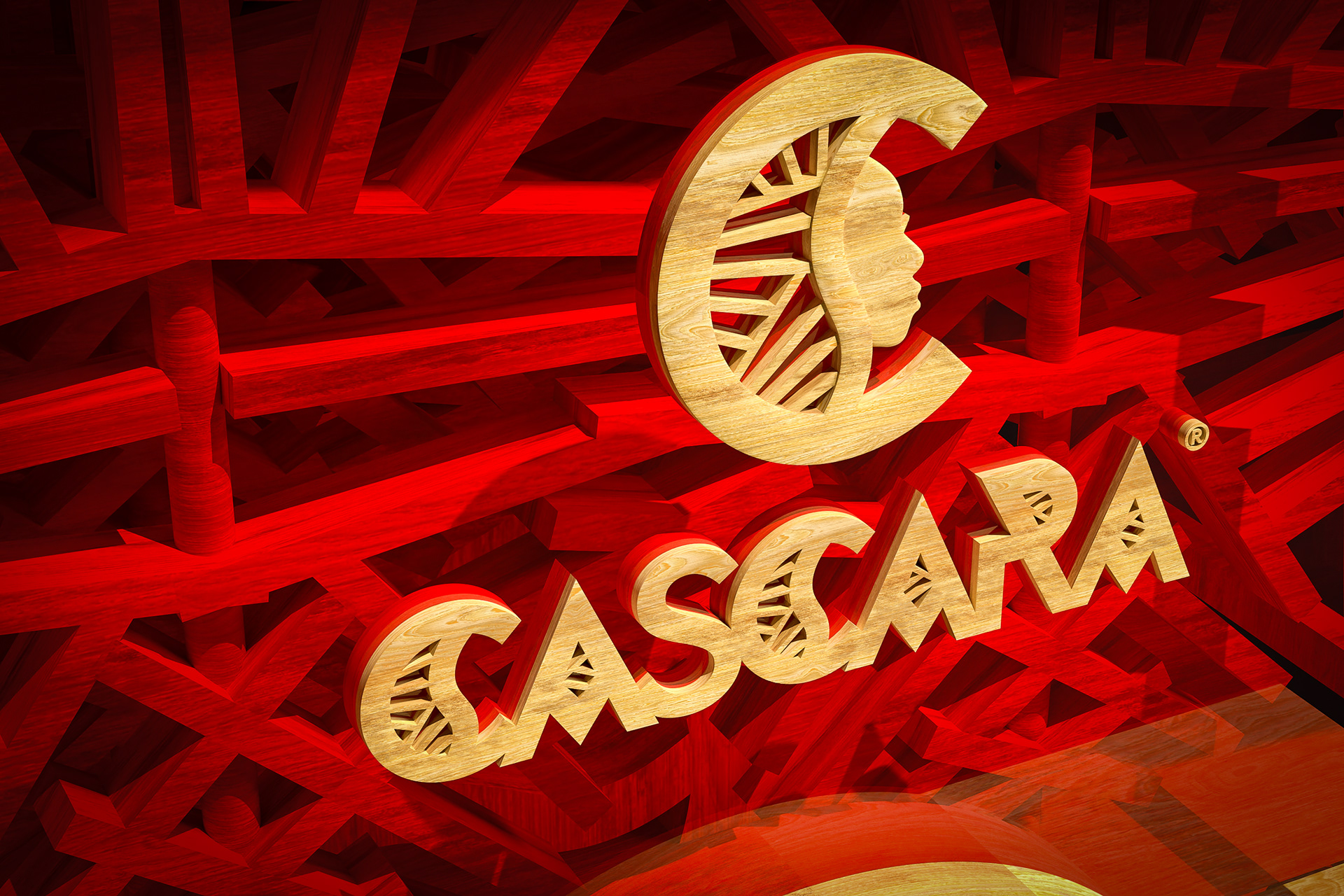
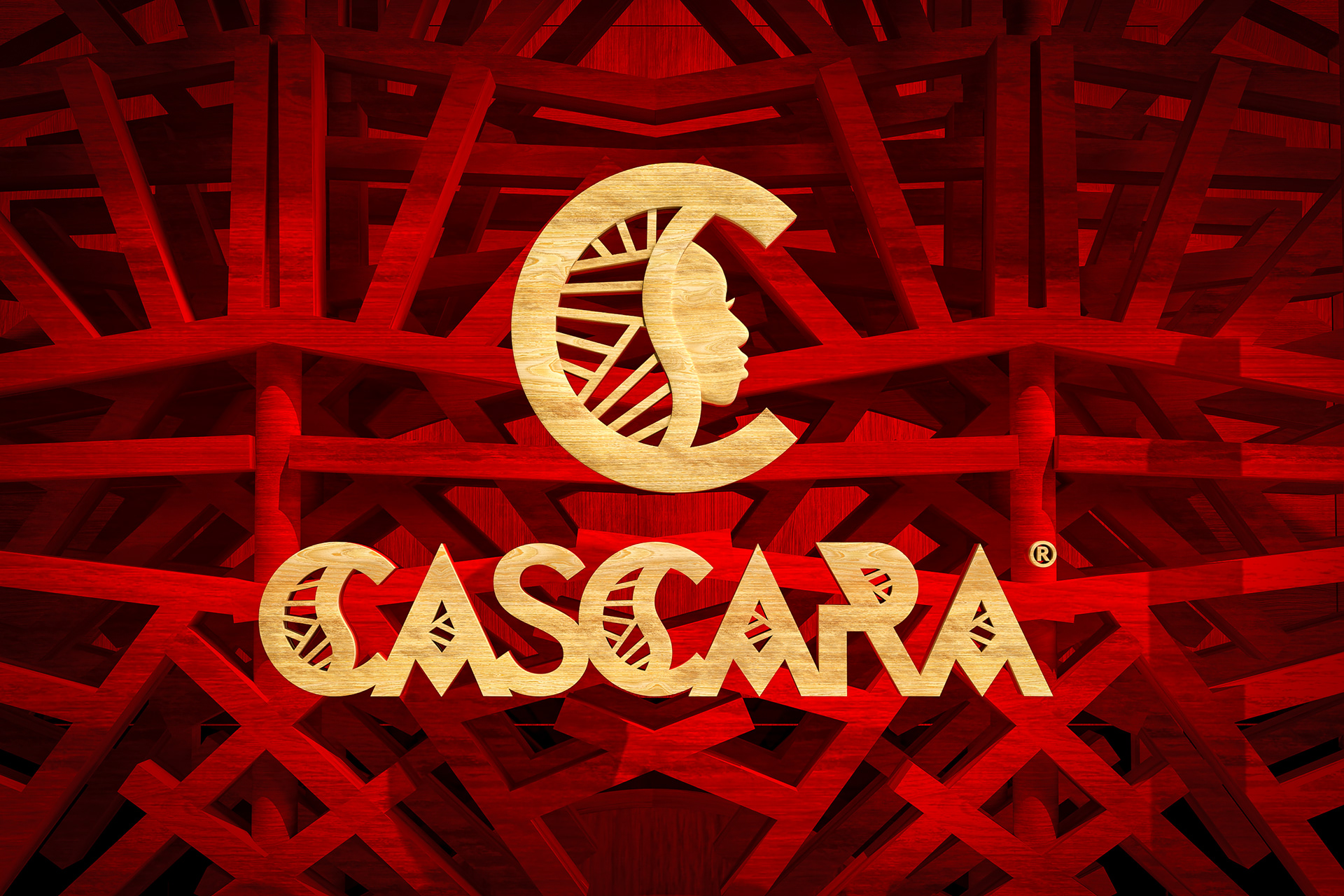

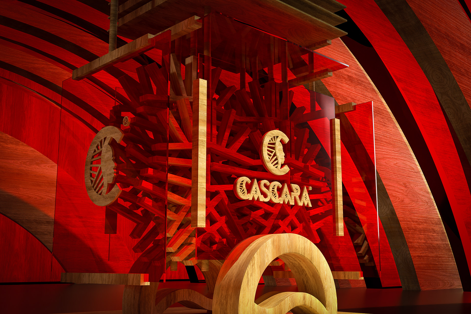

The CASCARA logo is a custom typographic design that integrates distinct graphic components into each letterform to establish a strong and coherent brand identity.
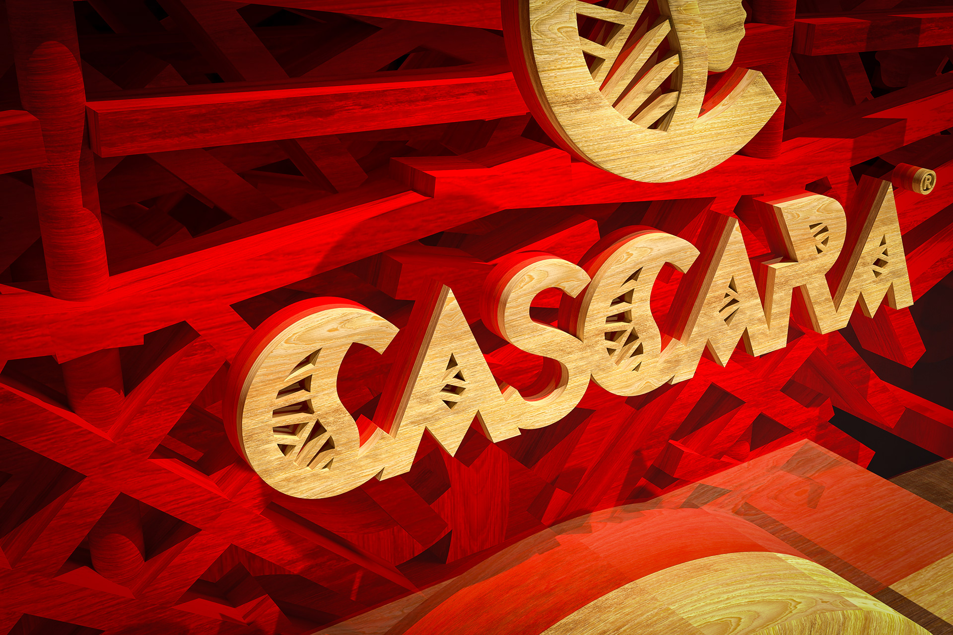
The logo is constructed with bespoke geometric characters, combining wide angular bases, sharp intersections, and consistent vertical cuts. All letters are capitalized, with three of them, the initial and central “C”, as well as the “A”s, embedding internal motifs that reference radial symmetry and carved patterning. These recurring elements unify the design while reinforcing the brand’s visual system.
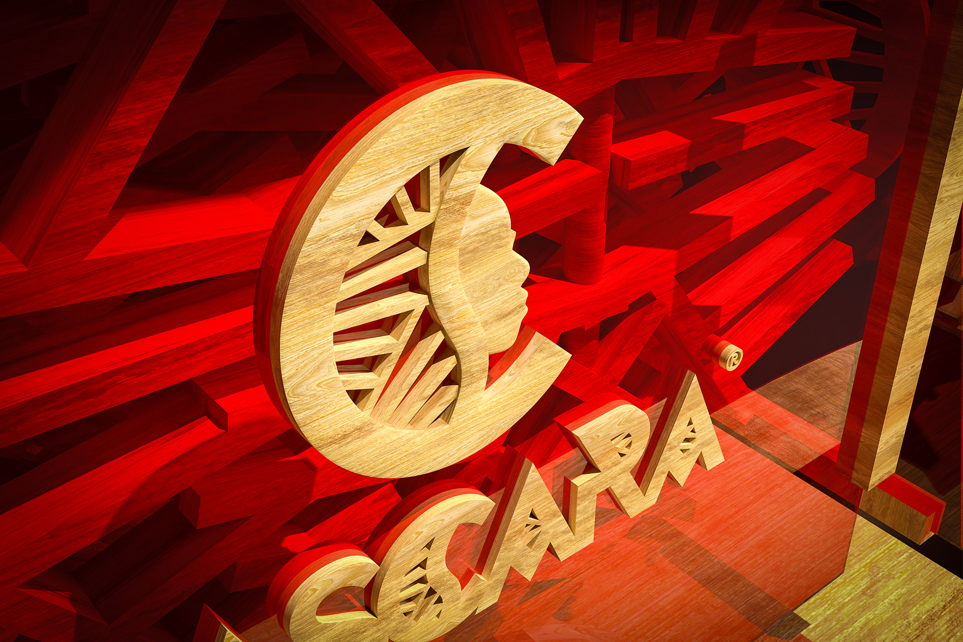
The letter “C” serves as both initial and symbol, hosting a circular inner graphic that includes a silhouetted human profile merged with ray-like lines. This motif appears again in the second “C”, and as simplified versions in the triangular apertures of the “A”s, maintaining typographic balance and structural alignment.
The entire composition functions as a graphic identity, not only as a wordmark, but as a complete design system with unique spatial relationships and visual consistency.