


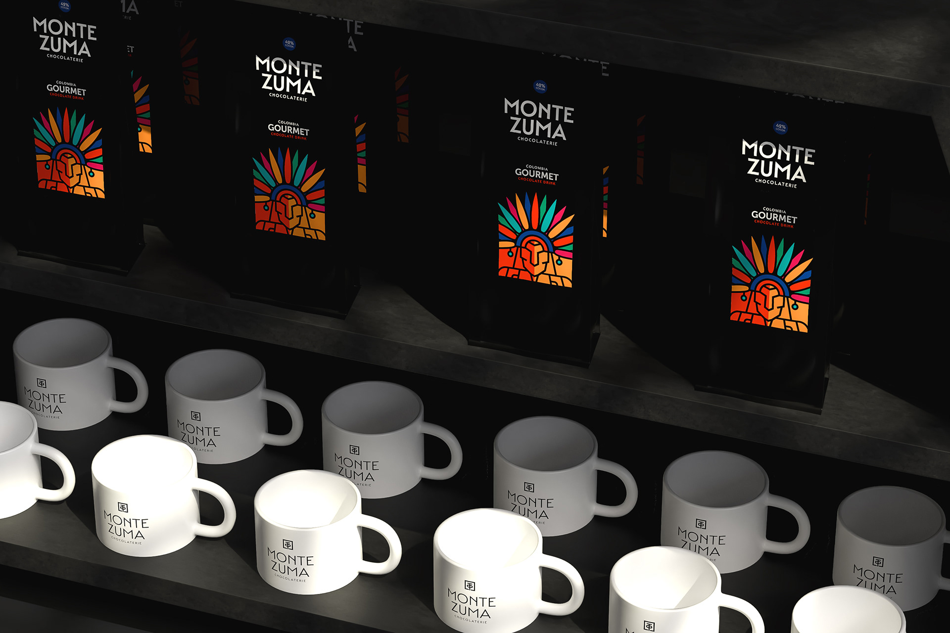
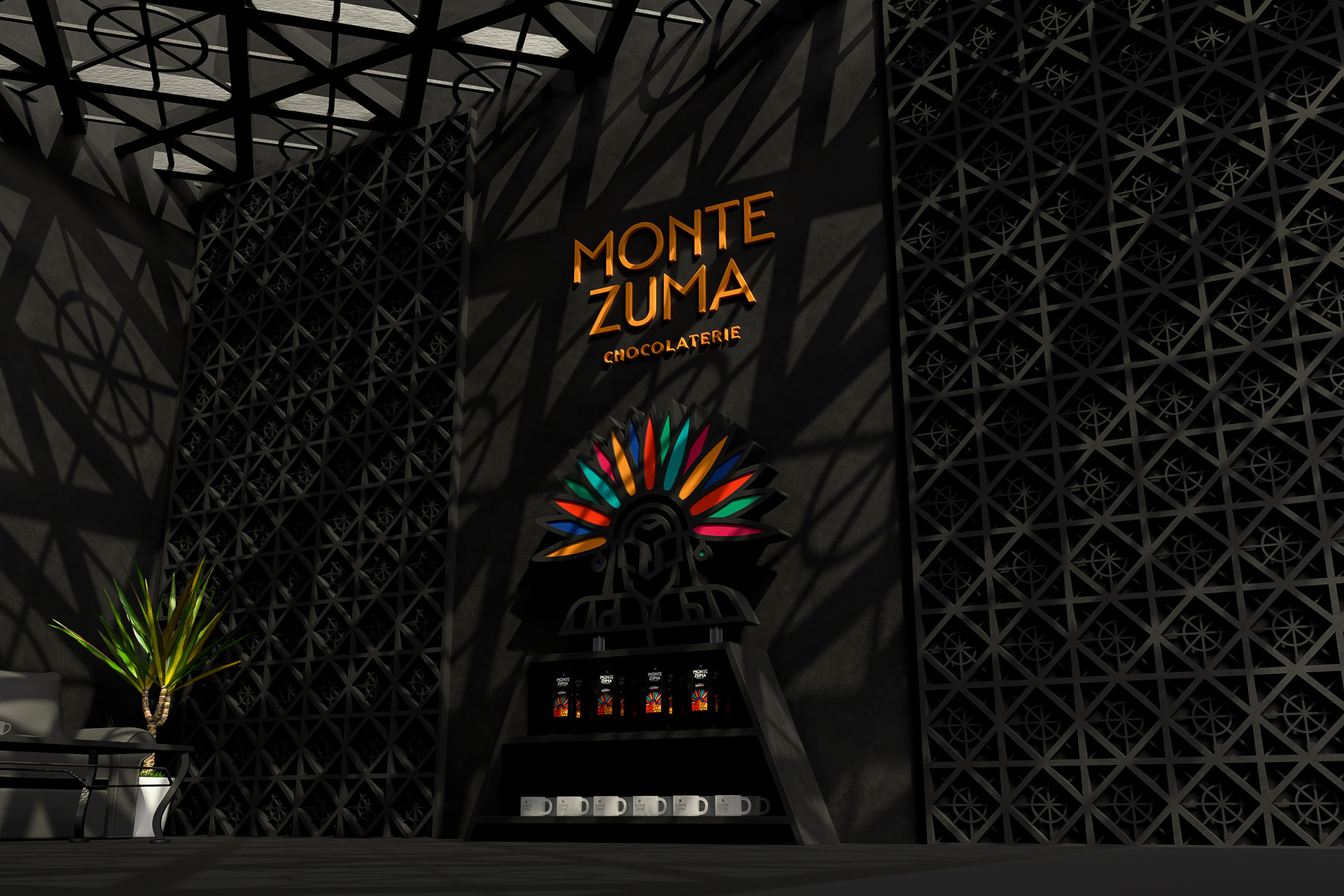
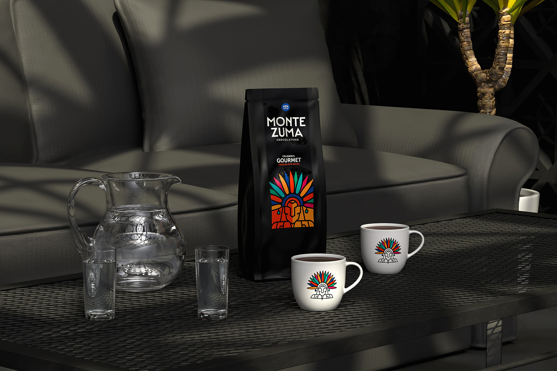
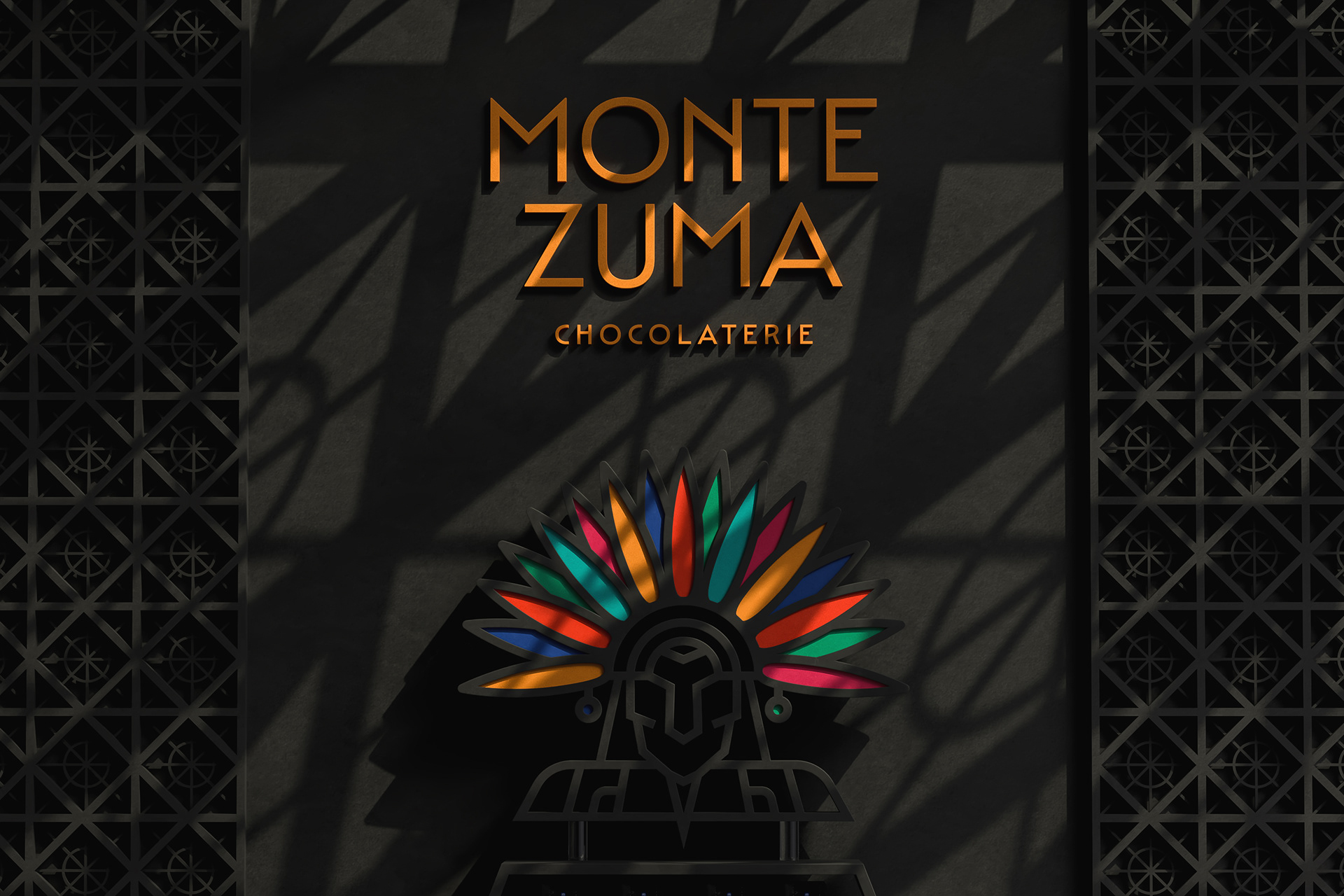

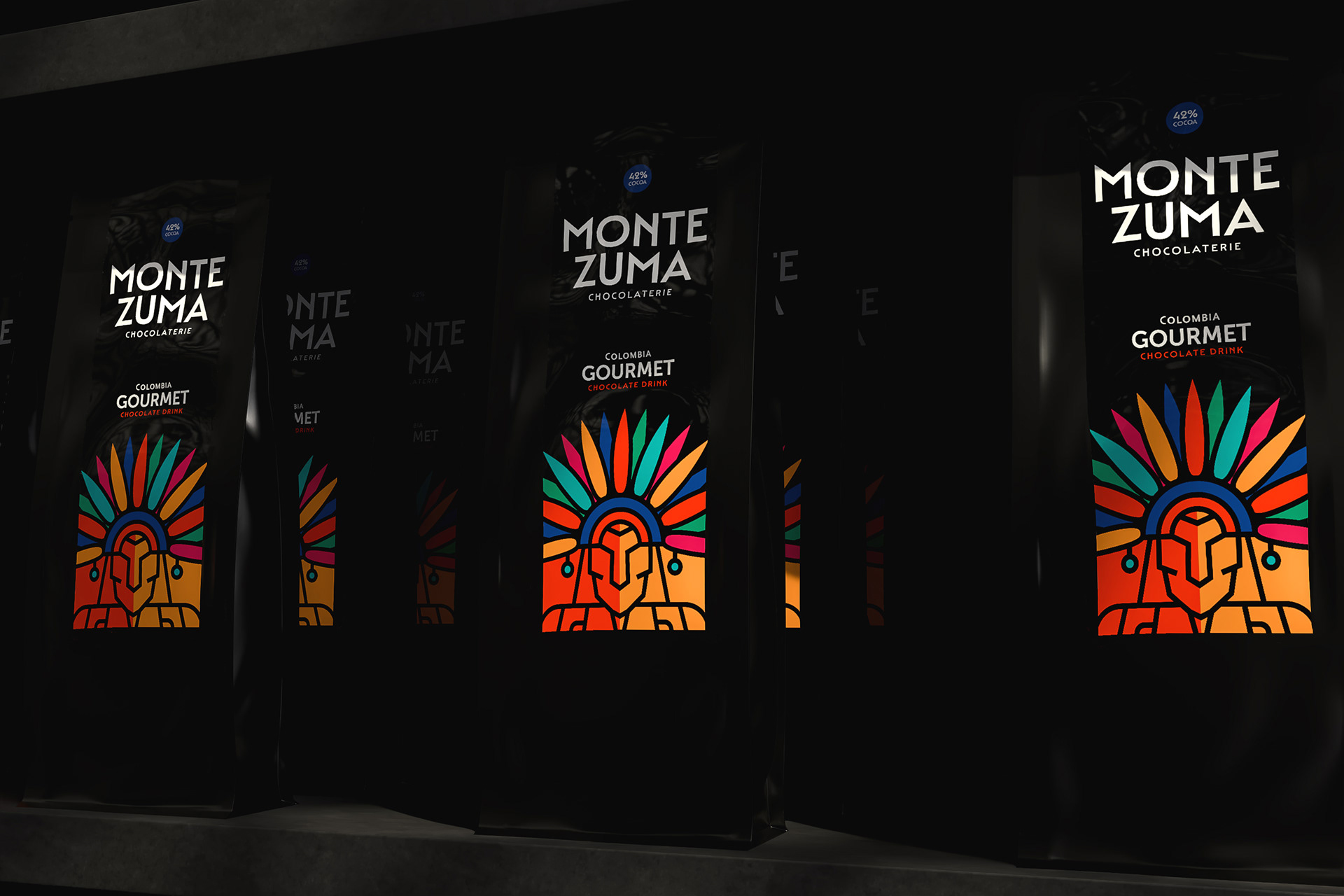

This project involved the design of the label for MONTEZUMA Chocolaterie, specifically created for a premium black package. The objective was to create a bold, distinctive visual that would both honor the brand’s cultural inspiration and stand out on dark, elegant packaging.
The label features a stylized, geometric illustration of a warrior figure crowned with a colorful feathered headdress. The strong, vibrant palette — combining orange, red, green, blue, and pink tones — brings energy and richness to the design, while the fine black contour lines maintain a sense of order, structure, and sophistication.
Typography was selected to complement the emblem: modern, bold, and clean, ensuring legibility and premium appeal without competing with the central illustration. The black package acts as a canvas, allowing the colorful visual identity to dominate with maximum impact, enhancing shelf presence and reinforcing the brand’s gourmet positioning.
The result is a high-impact label design that balances tradition, craftsmanship, and contemporary aesthetics — delivering a striking and memorable product appearance for MONTEZUMA Chocolaterie.