


Design: Logo & Concept Sign Application.
Client: Kosmaros.
Location: Thessaloniki / Greece.
Date: March 2026.
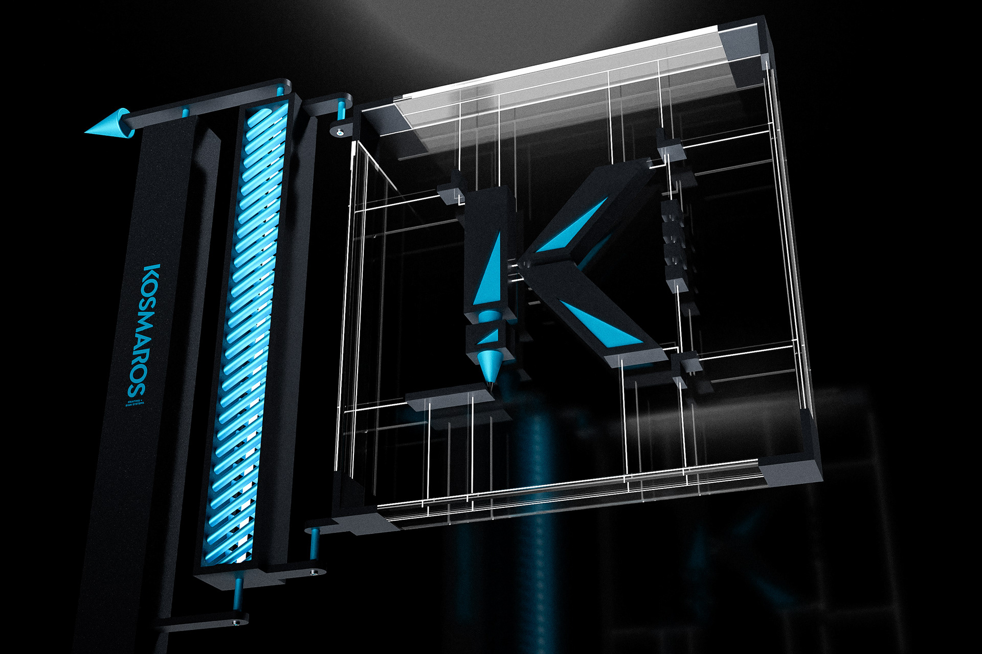
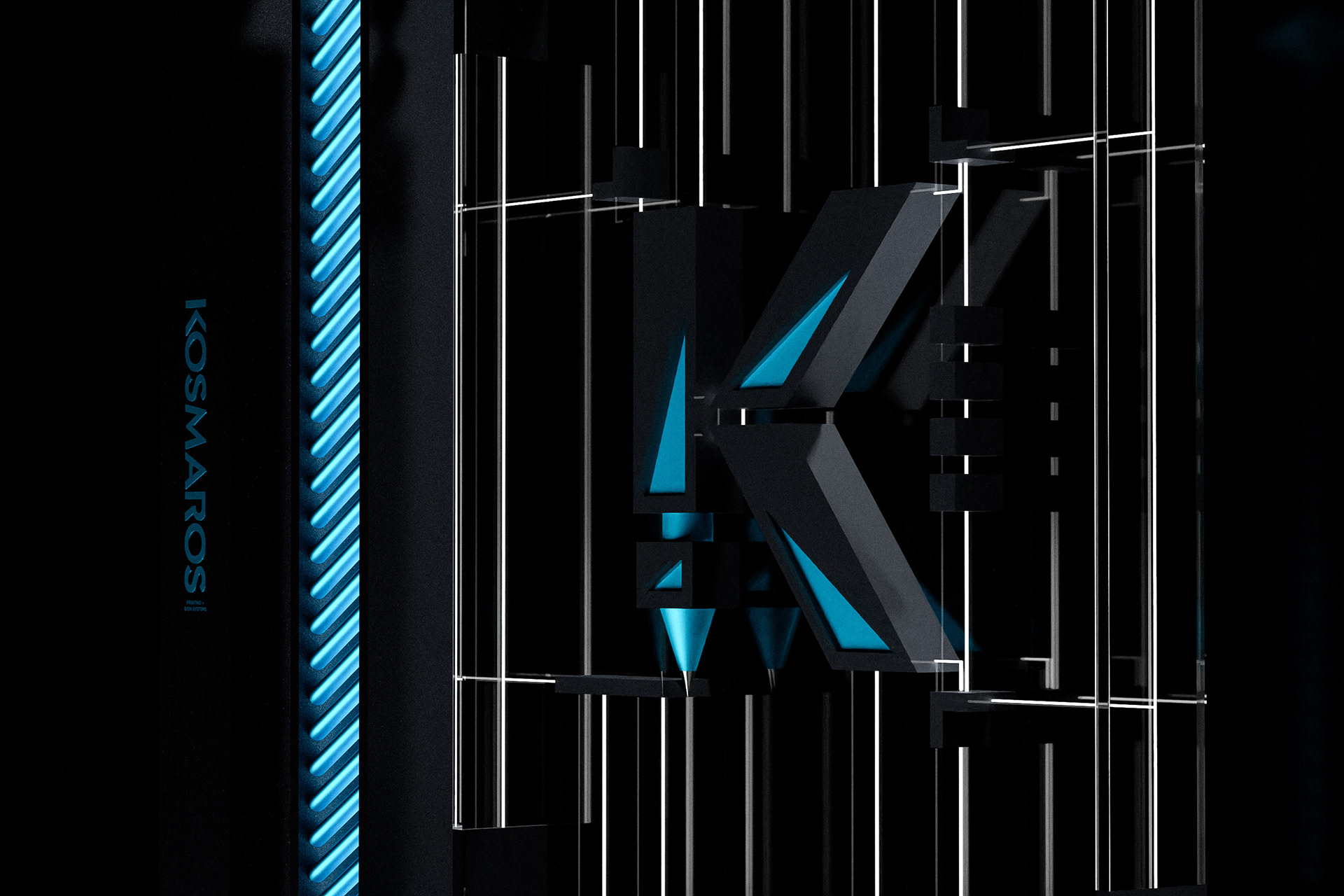
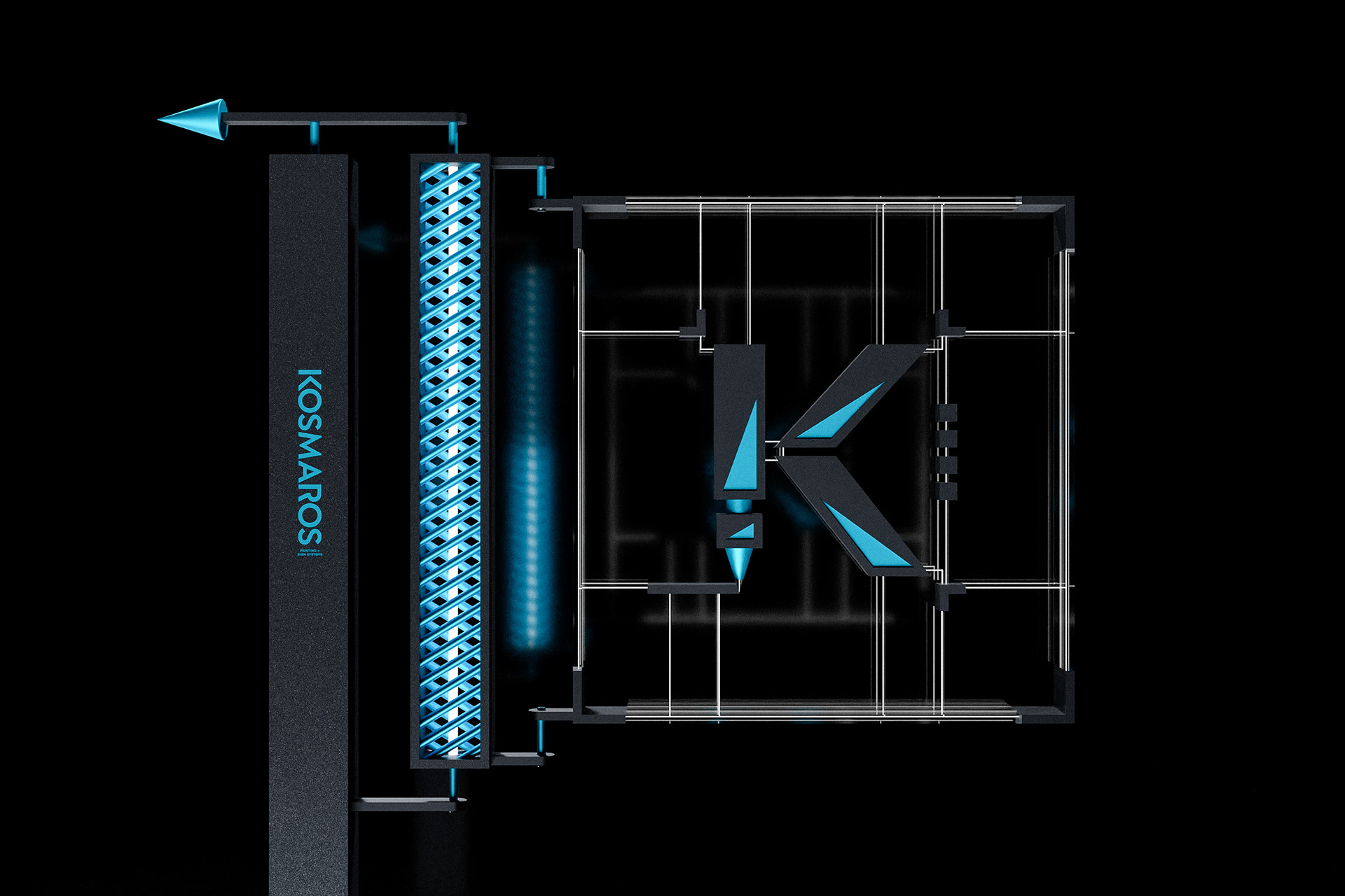
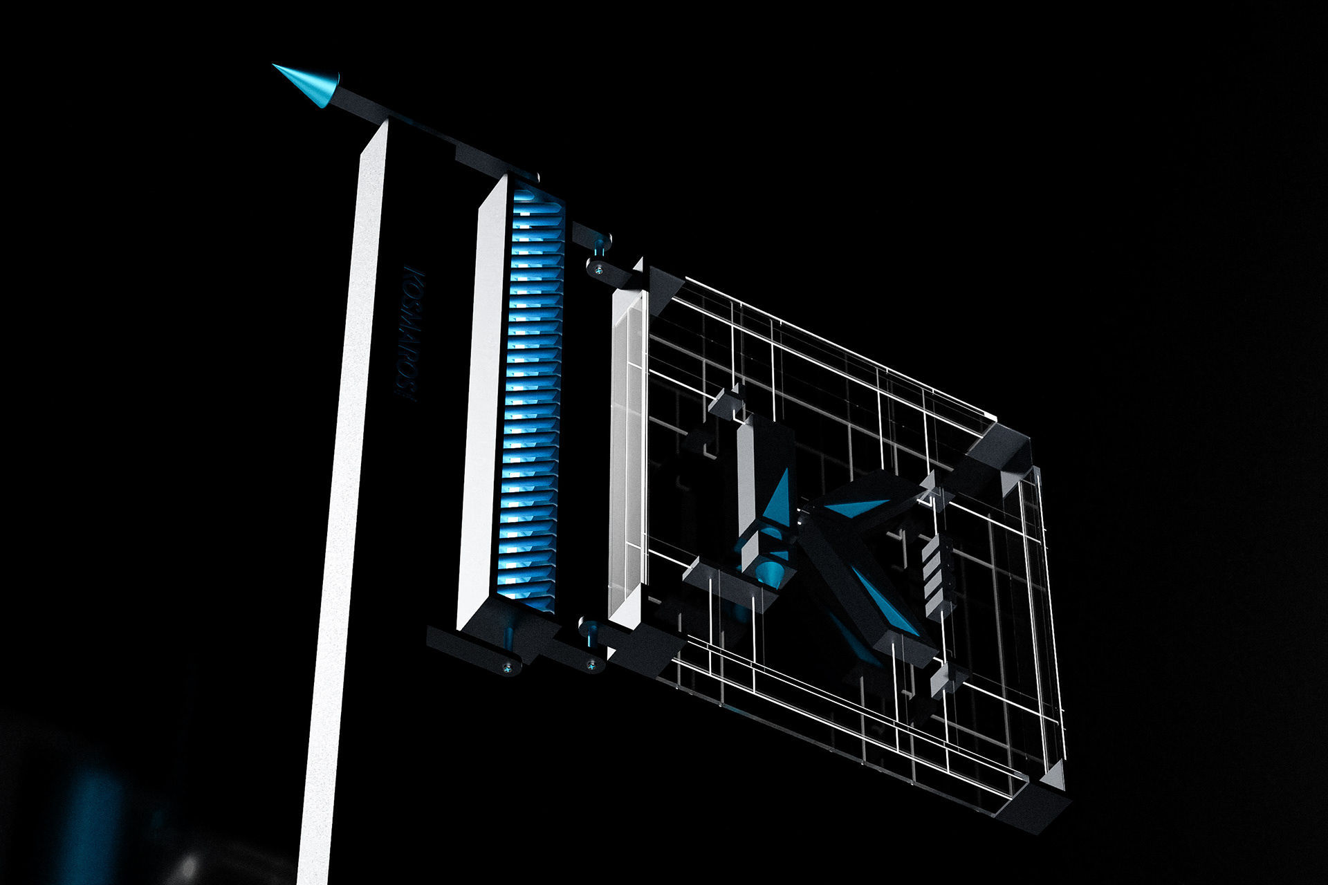
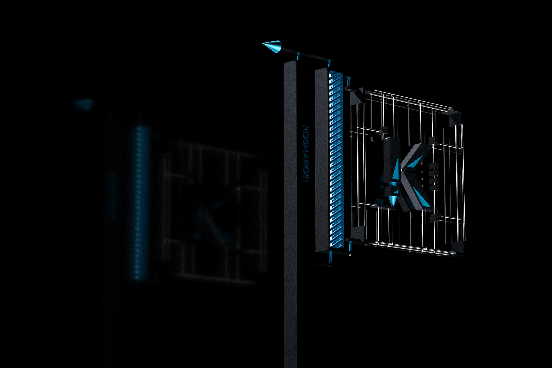
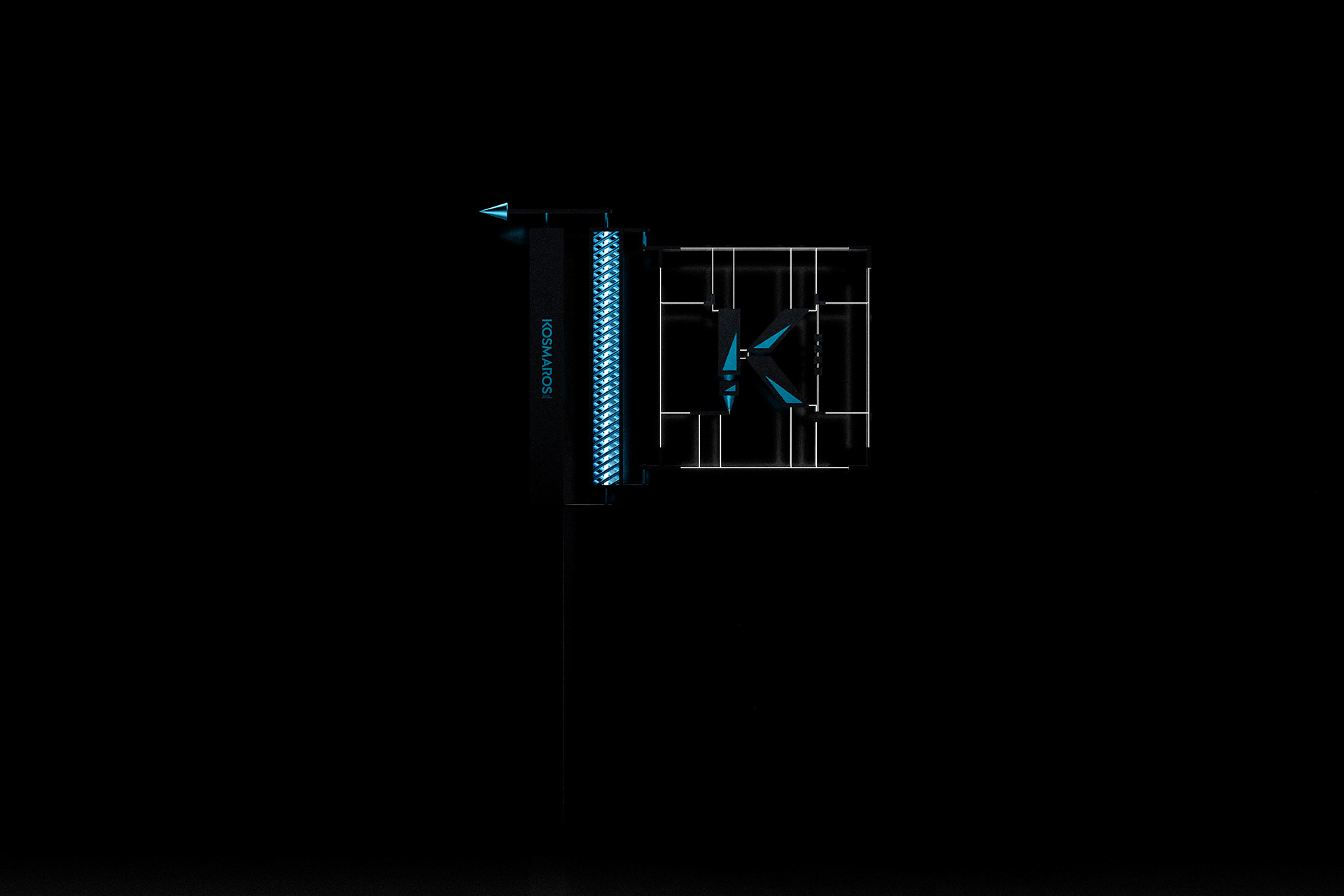
The logo for Kosmaros was developed as a precise emblem built on geometric structure and visual balance. The symbol is composed of sharp angular planes and controlled negative spaces that create a dynamic form while maintaining clarity and strong recognition. Rather than operating as a simple letterform, the mark functions as a constructed emblem that reflects the technical character of printing, vinyl cutting, and signage production.
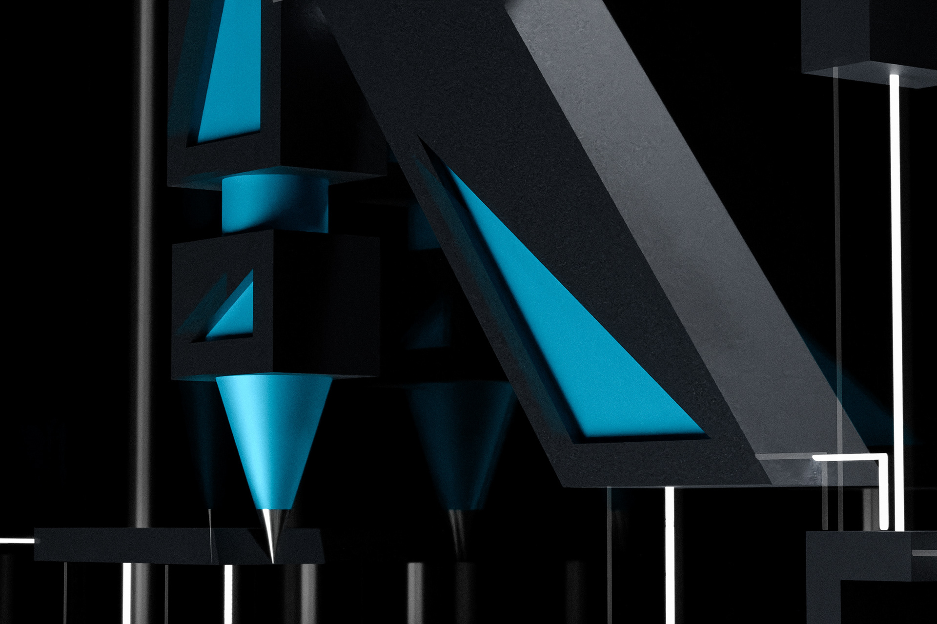
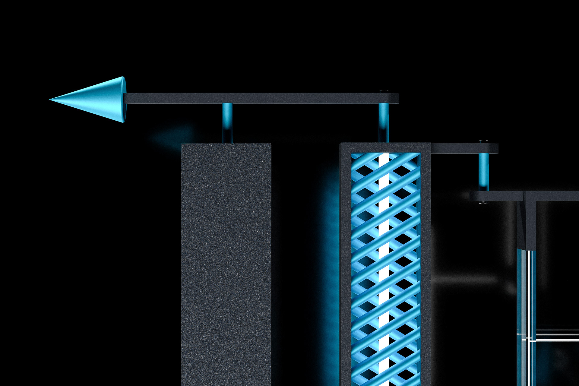
The composition follows a disciplined geometric logic. Triangular openings and angled surfaces introduce direction and suggest processes such as cutting, shaping, and material transformation. Subtle corner reference elements reinforce the technical nature of the identity, visually connecting the emblem with alignment, measurement, and production precision.
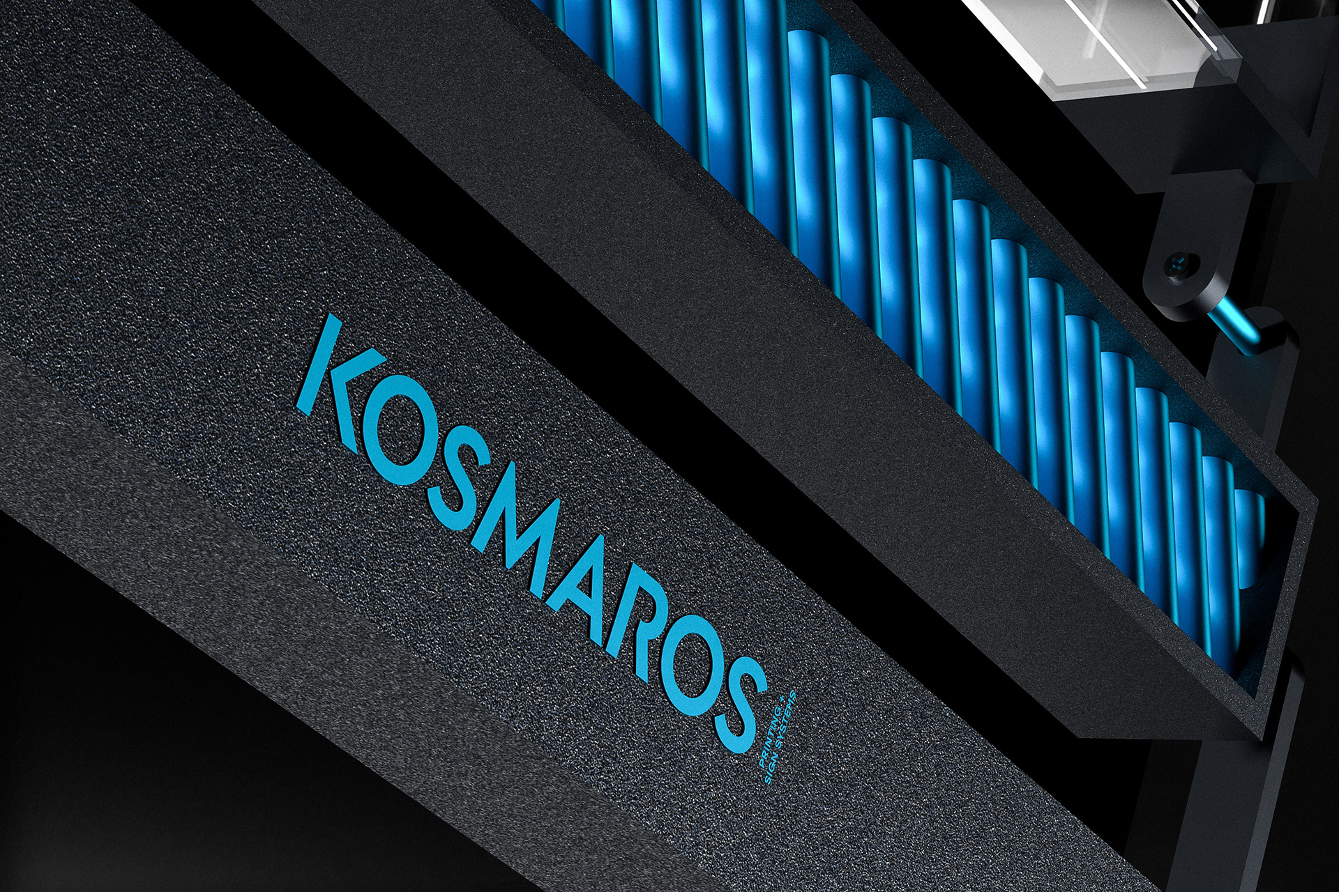
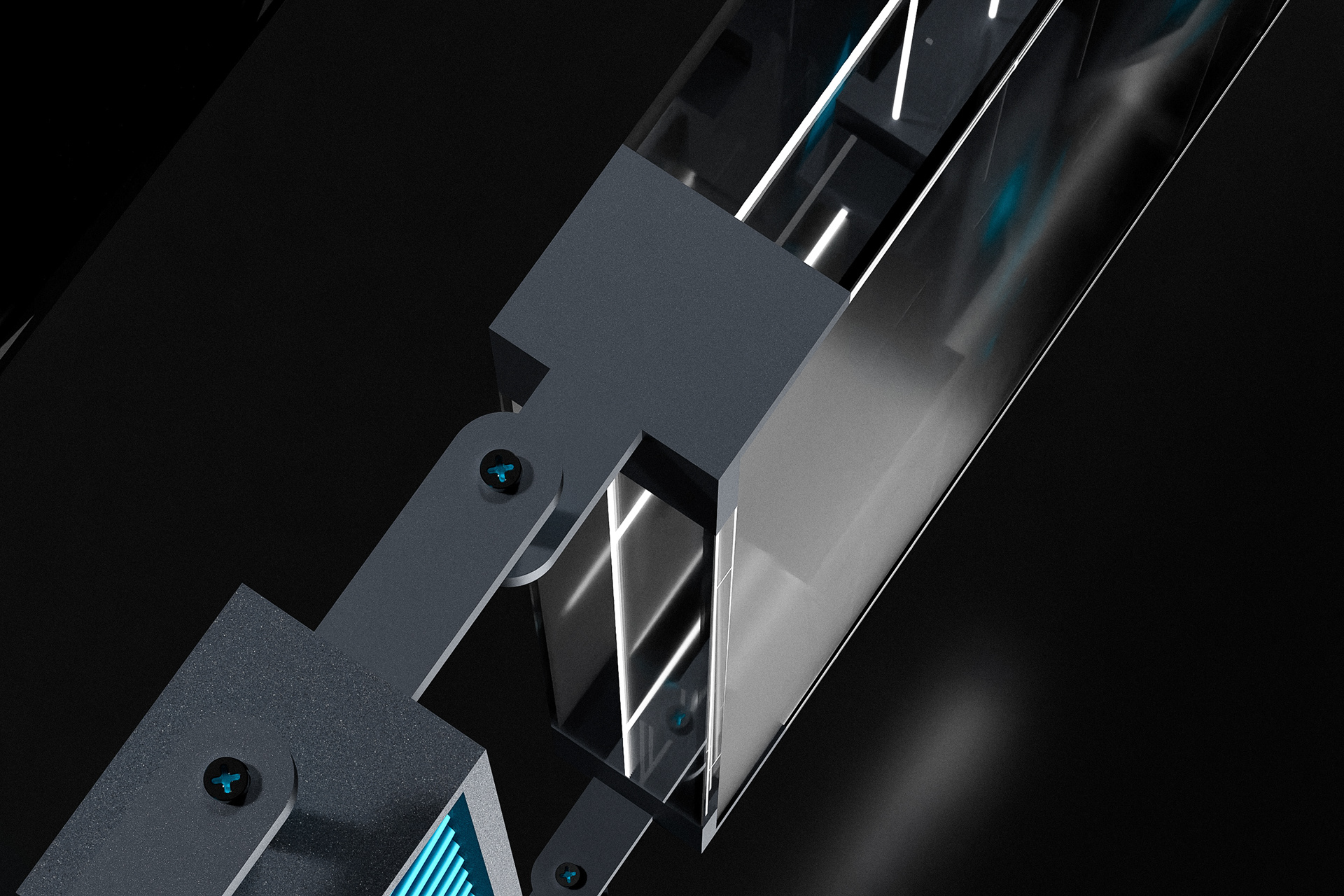
To explore the identity in a physical context, the logo was translated into a conceptual futuristic sign structure. Transparent surfaces, structural frames, and linear guides create an environment where the emblem appears as a constructed object. This approach connects the visual identity with the real world of signage production and fabrication.
⸻
Ο σχεδιασμός του λογοτύπου για την Kosmaros βασίζεται σε ένα γεωμετρικό έμβλημα με καθαρή δομή και οπτική ισορροπία. Το σύμβολο σχηματίζεται από κοφτές γωνιακές επιφάνειες και ελεγχόμενα κενά που δημιουργούν μια δυναμική μορφή με έντονη αναγνωρισιμότητα. Το έμβλημα λειτουργεί ως κατασκευασμένο σήμα που συνδέεται με τον τεχνικό χαρακτήρα της εκτύπωσης, της κοπής βινυλίου και της παραγωγής επιγραφών.
Η σύνθεση ακολουθεί αυστηρή γεωμετρική λογική. Τα τριγωνικά ανοίγματα και οι λοξές επιφάνειες δημιουργούν αίσθηση κατεύθυνσης και παραπέμπουν σε διαδικασίες κοπής και διαμόρφωσης υλικών. Τα στοιχεία γωνιακής οριοθέτησης ενισχύουν τον τεχνικό χαρακτήρα του σήματος και συνδέουν οπτικά το έμβλημα με διαδικασίες ευθυγράμμισης και παραγωγής.
Για να εξερευνηθεί η ταυτότητα σε φυσικό περιβάλλον, το λογότυπο μεταφράστηκε σε μια concept φουτουριστική επιγραφή. Διαφανείς επιφάνειες, δομικά πλαίσια και γραμμικοί οδηγοί δημιουργούν ένα περιβάλλον όπου το έμβλημα εμφανίζεται ως κατασκευασμένο αντικείμενο. Η προσέγγιση αυτή συνδέει την οπτική ταυτότητα με τον πραγματικό κόσμο της κατασκευής επιγραφών.
www.id3a.gr
#logodesign #branding #signage #visualidentity #thessaloniki #greece
Client: Kosmaros.
Location: Thessaloniki / Greece.
Date: March 2026.
The logo for Kosmaros was developed as a precise emblem built on geometric structure and visual balance. The symbol is composed of sharp angular planes and controlled negative spaces that create a dynamic form while maintaining clarity and strong recognition. Rather than operating as a simple letterform, the mark functions as a constructed emblem that reflects the technical character of printing, vinyl cutting, and signage production.
The composition follows a disciplined geometric logic. Triangular openings and angled surfaces introduce direction and suggest processes such as cutting, shaping, and material transformation. Subtle corner reference elements reinforce the technical nature of the identity, visually connecting the emblem with alignment, measurement, and production precision.
To explore the identity in a physical context, the logo was translated into a conceptual futuristic sign structure. Transparent surfaces, structural frames, and linear guides create an environment where the emblem appears as a constructed object. This approach connects the visual identity with the real world of signage production and fabrication.
⸻
Ο σχεδιασμός του λογοτύπου για την Kosmaros βασίζεται σε ένα γεωμετρικό έμβλημα με καθαρή δομή και οπτική ισορροπία. Το σύμβολο σχηματίζεται από κοφτές γωνιακές επιφάνειες και ελεγχόμενα κενά που δημιουργούν μια δυναμική μορφή με έντονη αναγνωρισιμότητα. Το έμβλημα λειτουργεί ως κατασκευασμένο σήμα που συνδέεται με τον τεχνικό χαρακτήρα της εκτύπωσης, της κοπής βινυλίου και της παραγωγής επιγραφών.
Η σύνθεση ακολουθεί αυστηρή γεωμετρική λογική. Τα τριγωνικά ανοίγματα και οι λοξές επιφάνειες δημιουργούν αίσθηση κατεύθυνσης και παραπέμπουν σε διαδικασίες κοπής και διαμόρφωσης υλικών. Τα στοιχεία γωνιακής οριοθέτησης ενισχύουν τον τεχνικό χαρακτήρα του σήματος και συνδέουν οπτικά το έμβλημα με διαδικασίες ευθυγράμμισης και παραγωγής.
Για να εξερευνηθεί η ταυτότητα σε φυσικό περιβάλλον, το λογότυπο μεταφράστηκε σε μια concept φουτουριστική επιγραφή. Διαφανείς επιφάνειες, δομικά πλαίσια και γραμμικοί οδηγοί δημιουργούν ένα περιβάλλον όπου το έμβλημα εμφανίζεται ως κατασκευασμένο αντικείμενο. Η προσέγγιση αυτή συνδέει την οπτική ταυτότητα με τον πραγματικό κόσμο της κατασκευής επιγραφών.
www.id3a.gr
#logodesign #branding #signage #visualidentity #thessaloniki #greece