

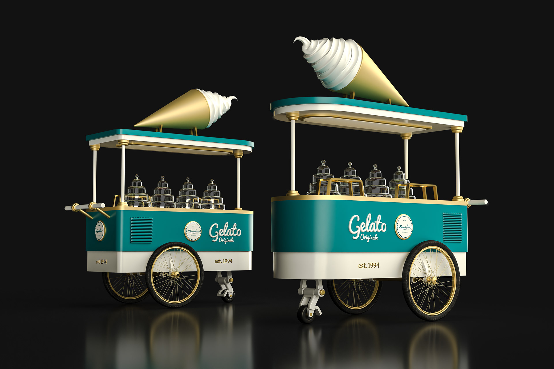


This ice cream cart was illustrated as a stylized brand element, designed specifically for large-format decorative applications at Charalambos Patisserie.
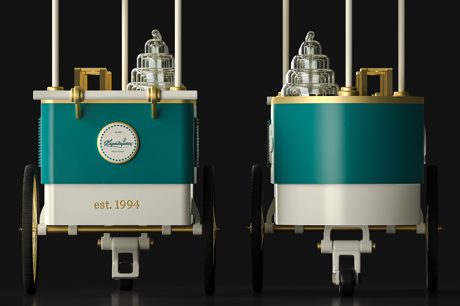
Its geometry is defined by clean, rounded shapes and minimal contours, striking a balance between softness and clarity. The structure is symmetrical, with subtle detailing in the wheels, panels, and canopy to preserve visual rhythm without unnecessary complexity.
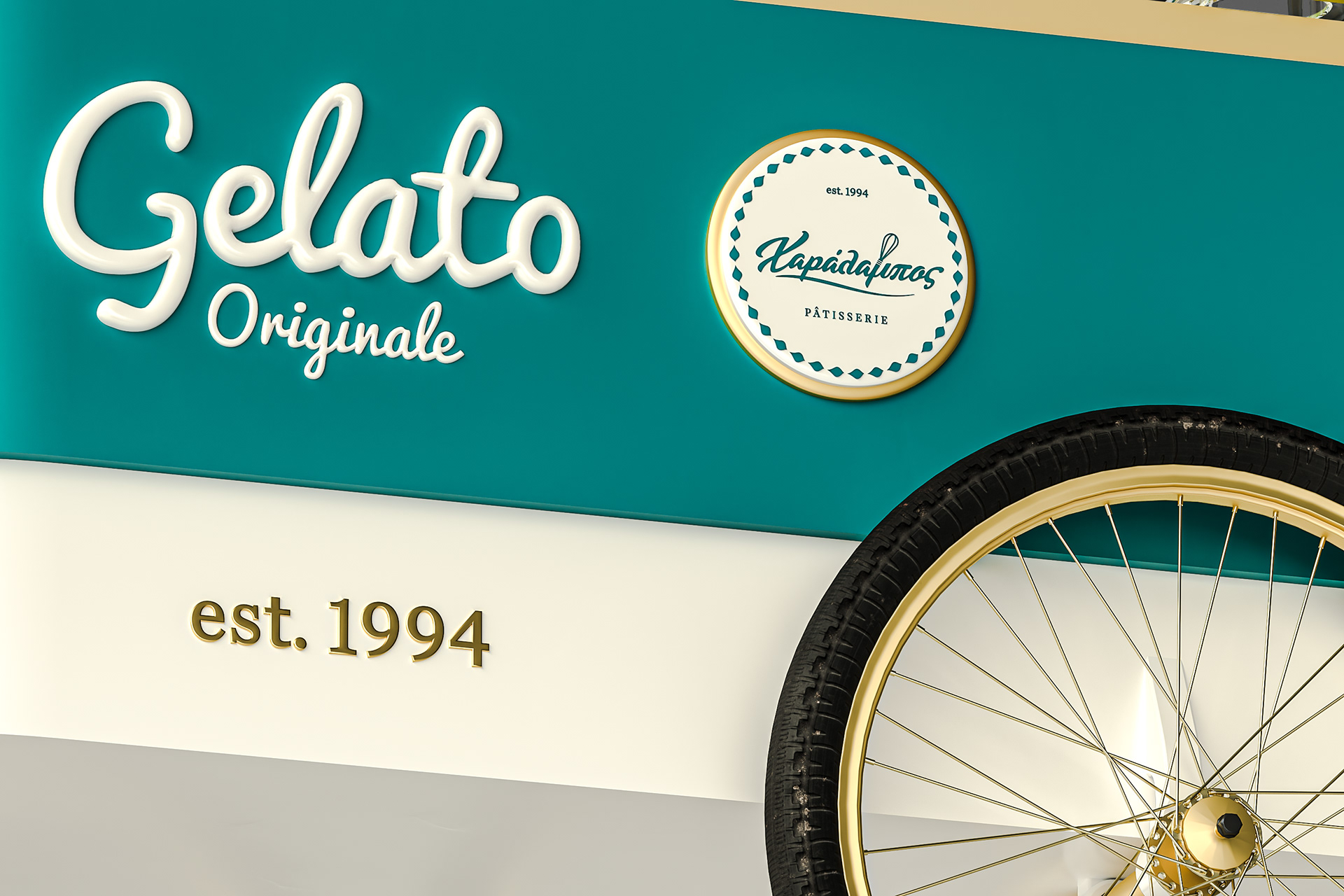
A typographic sign crowns the cart, directly aligned with the brand’s overall style. The coral, brown, and white palette was developed exclusively for the ice cream category, differentiating the composition while remaining coherent with the brand’s design system.