


Design: High Protein Dessert 200gr.
Client: Mitato Dairy.
Location: Thessaloniki / Hellas.
Date: February 2024.
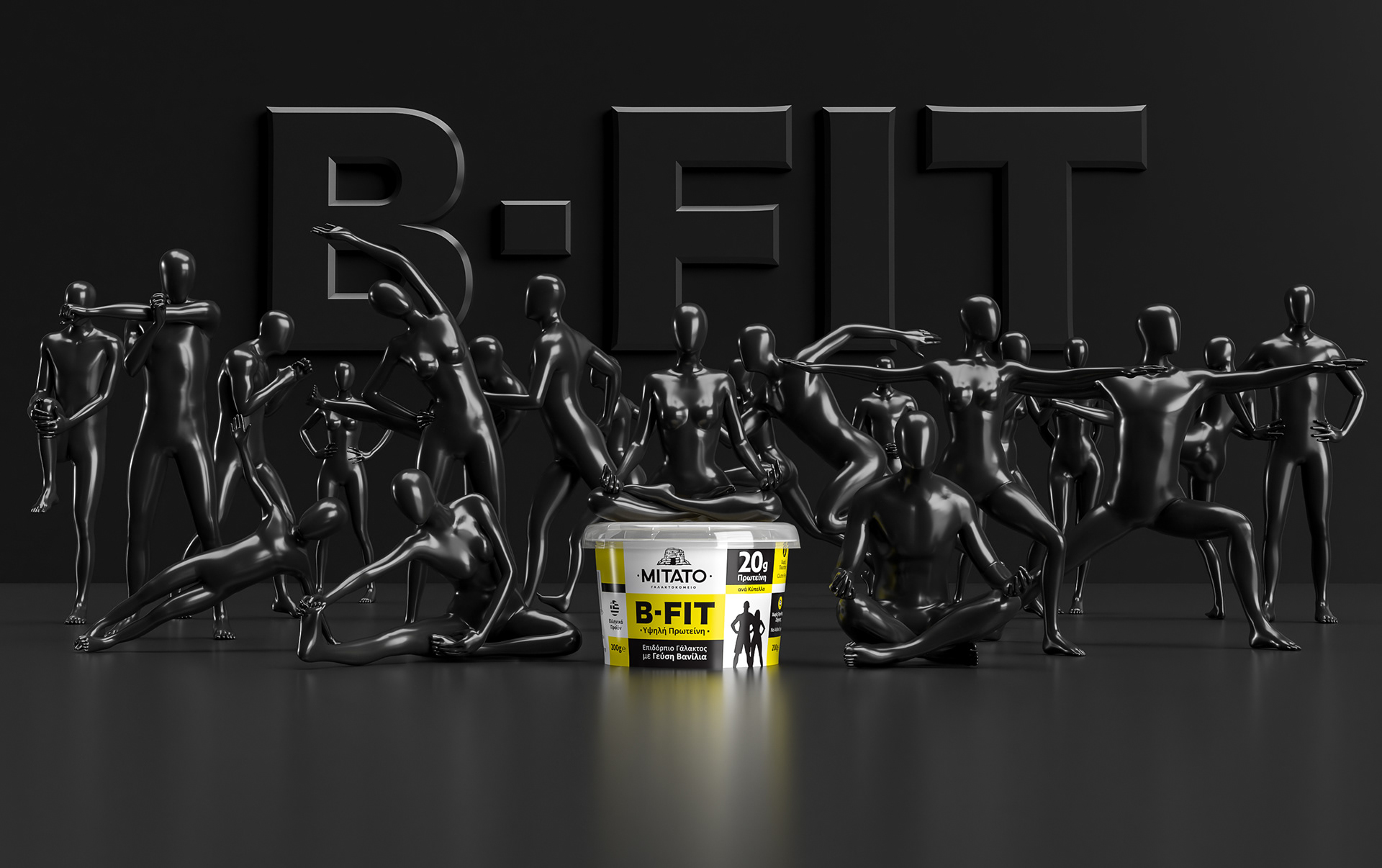
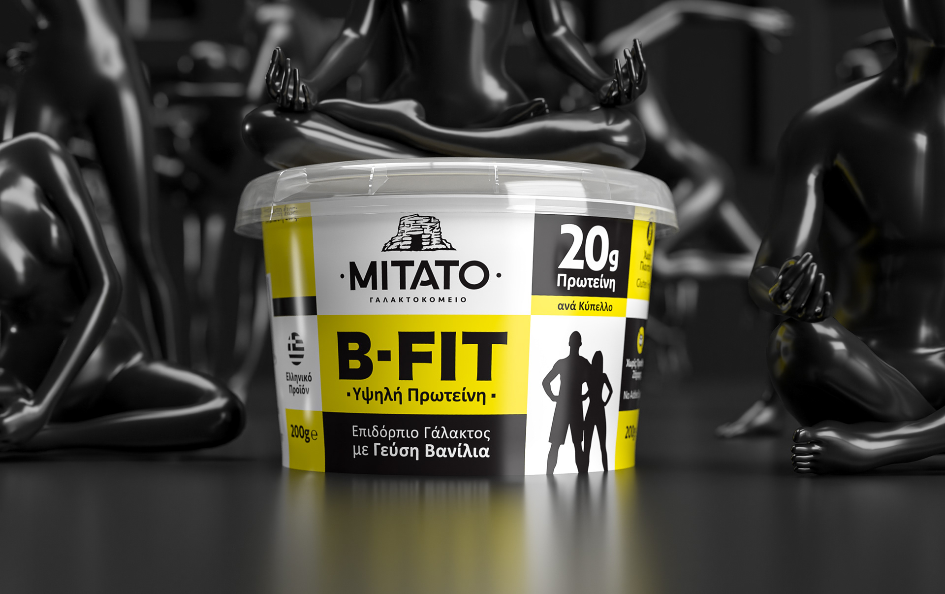
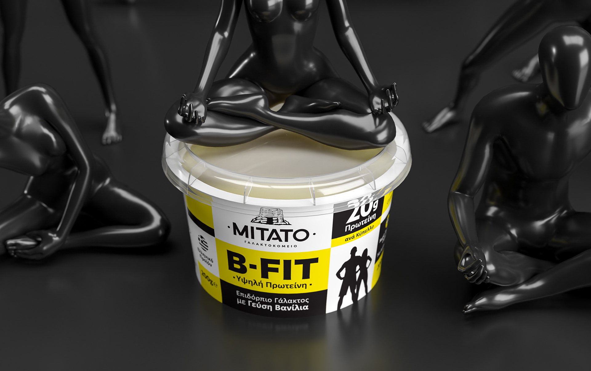
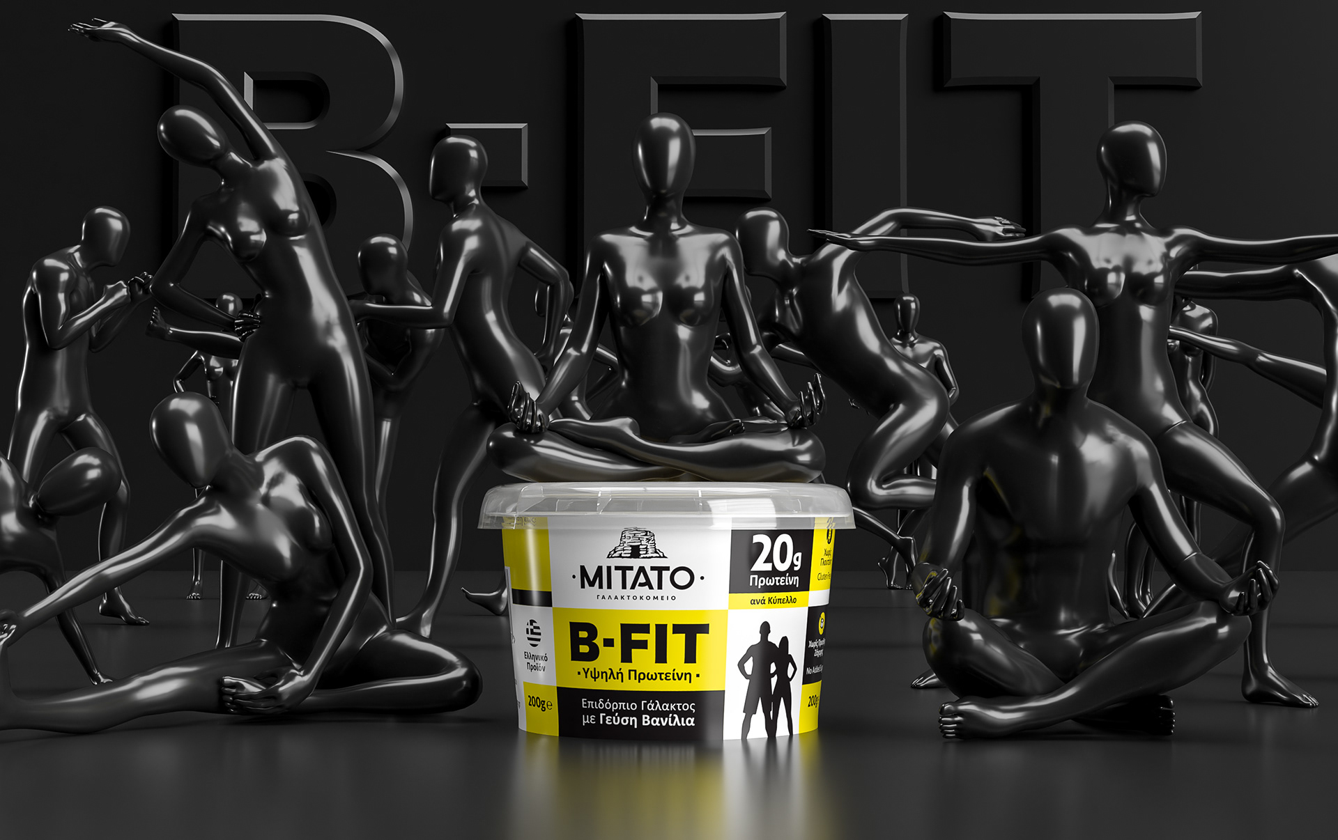
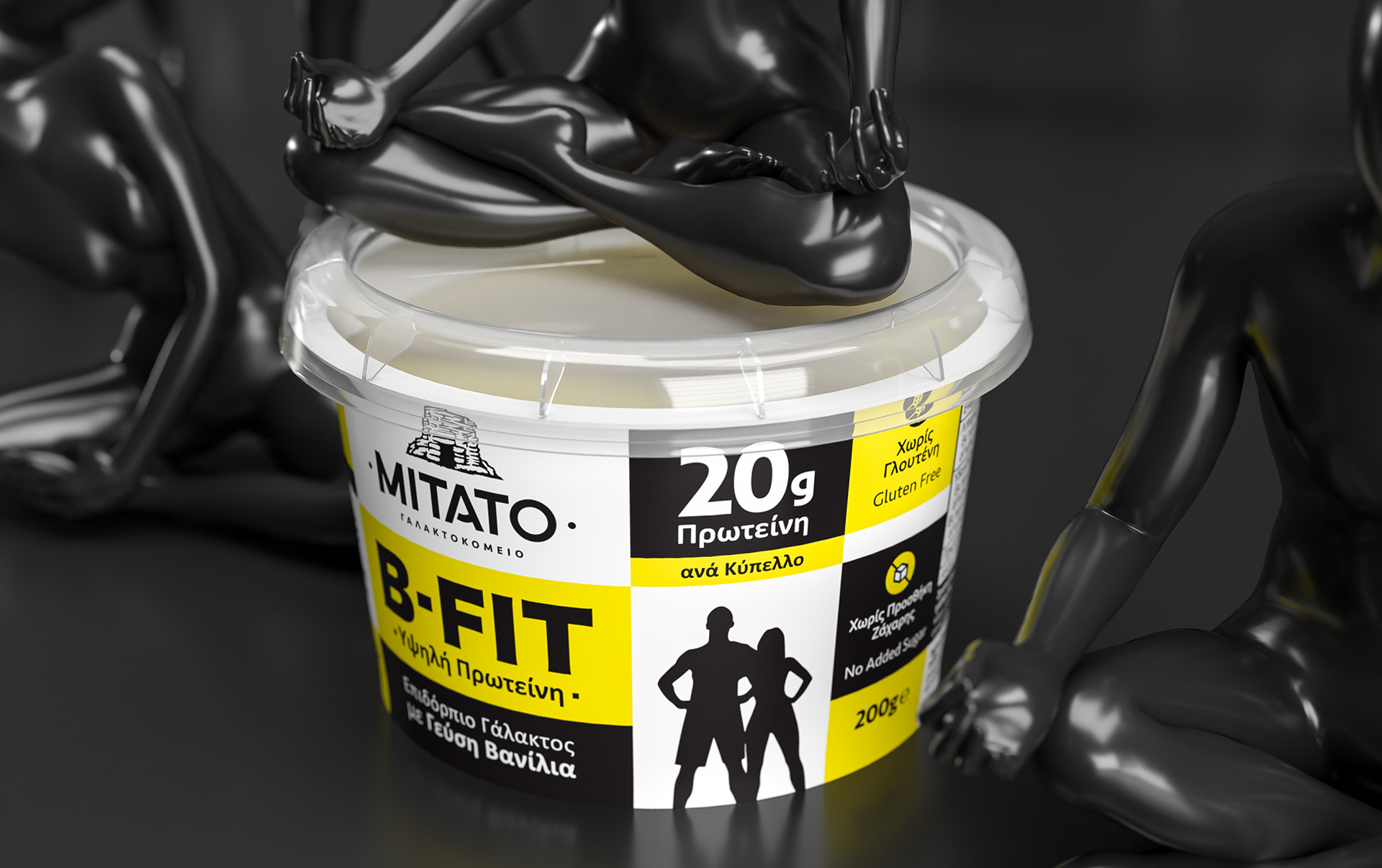
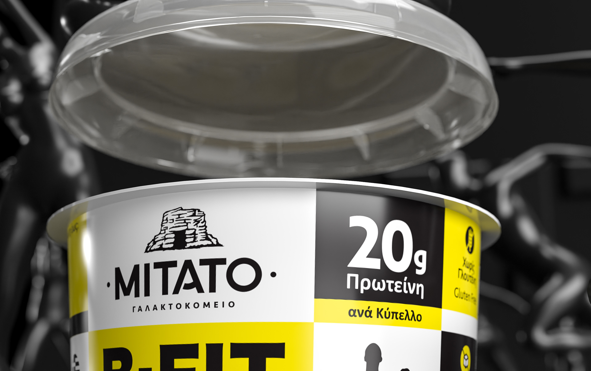
The design of the B-FIT high protein dessert packaging focuses on clarity, strength, and visual balance. The combination of white, black, and yellow enhances product recognition and communicates energy and precision. Typography and structure were developed to emphasize the nutritional content while maintaining a clean, confident aesthetic that reflects the product’s identity.
Ο σχεδιασμός της συσκευασίας του επιδόρπιου B-FIT υψηλής πρωτεΐνης εστιάζει στη σαφήνεια, τη δύναμη και την οπτική ισορροπία. Ο συνδυασμός λευκού, μαύρου και κίτρινου ενισχύει την αναγνωρισιμότητα και αποδίδει ενέργεια και ακρίβεια. Η τυπογραφία και η δομή αναπτύχθηκαν ώστε να αναδεικνύουν τη διατροφική αξία του προϊόντος, διατηρώντας καθαρή και σίγουρη αισθητική που αντικατοπτρίζει τον χαρακτήρα του.
#packagingdesign #productdesign #mitatodairy #visualidentity #thessaloniki #greece