


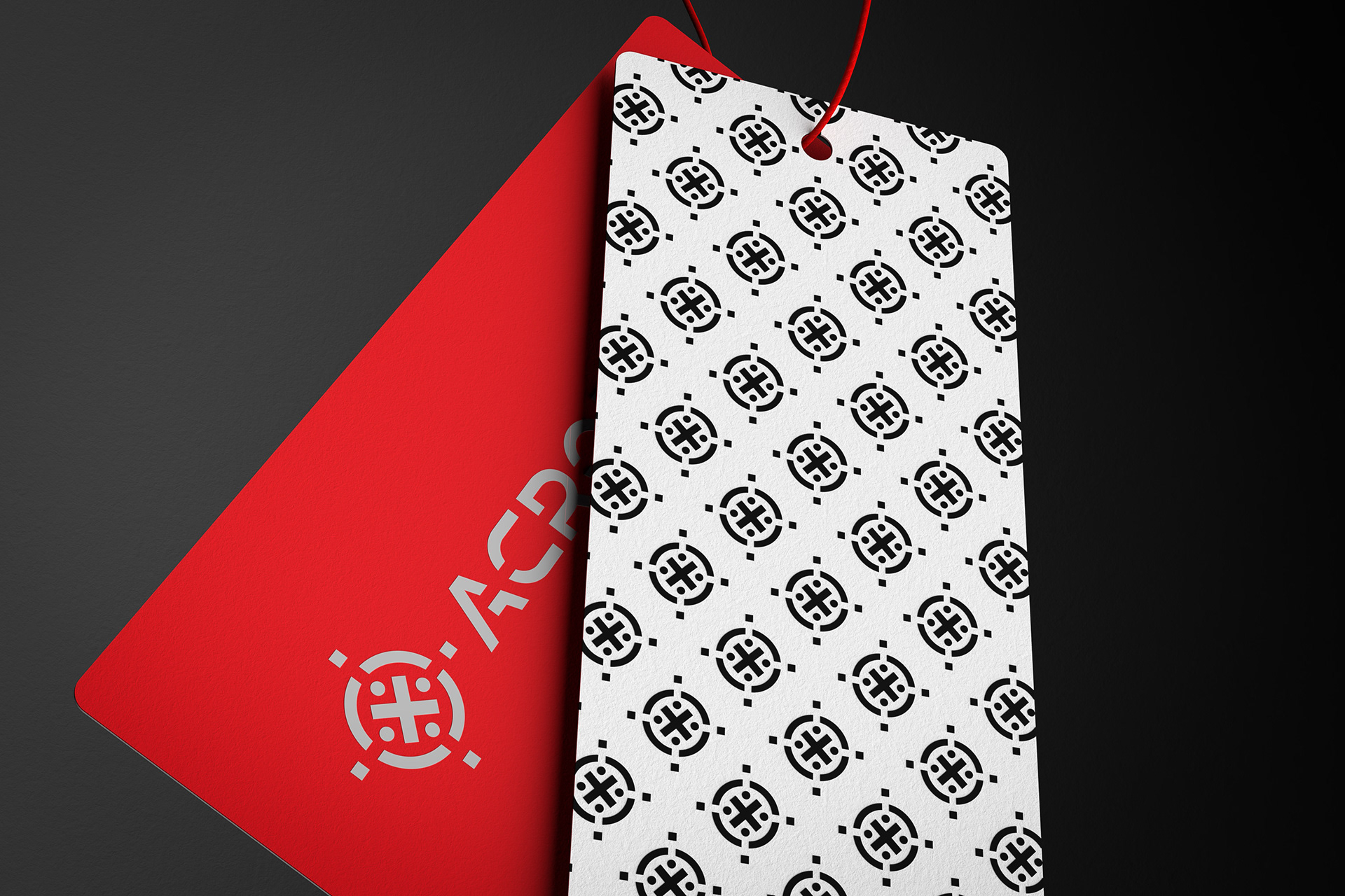
The ACRONITH® hang tag was designed to complement the brand’s bold urban identity through a minimal, impactful approach. The design features two connected tags: a vivid red tag bearing the brand’s wordmark and emblem, and a secondary black tag providing essential product information.
The black tag presents a clean composition with a vertical barcode, the brand website, and a statement of exclusivity – “Specially Designed for ACRONITH®”. Sharp typography and the high contrast between black, red, and white enhance readability and visual impact.
A custom repeat pattern, created from the ACRONITH® emblem, decorates the reverse side of the black tag. This element reinforces brand consistency and adds an extra layer of visual dynamism without overwhelming the overall design.
Through the combination of sharp color contrasts, minimal graphics, and strategic use of branding elements, the hang tag was developed to serve both a functional and strong visual role, reinforcing the identity of ACRONITH® garments at every touchpoint.