Design: Corporate Vehicle Branding.
Client: Thrace Marble.
Location: Xanthi / Greece.
Date: August 2023.
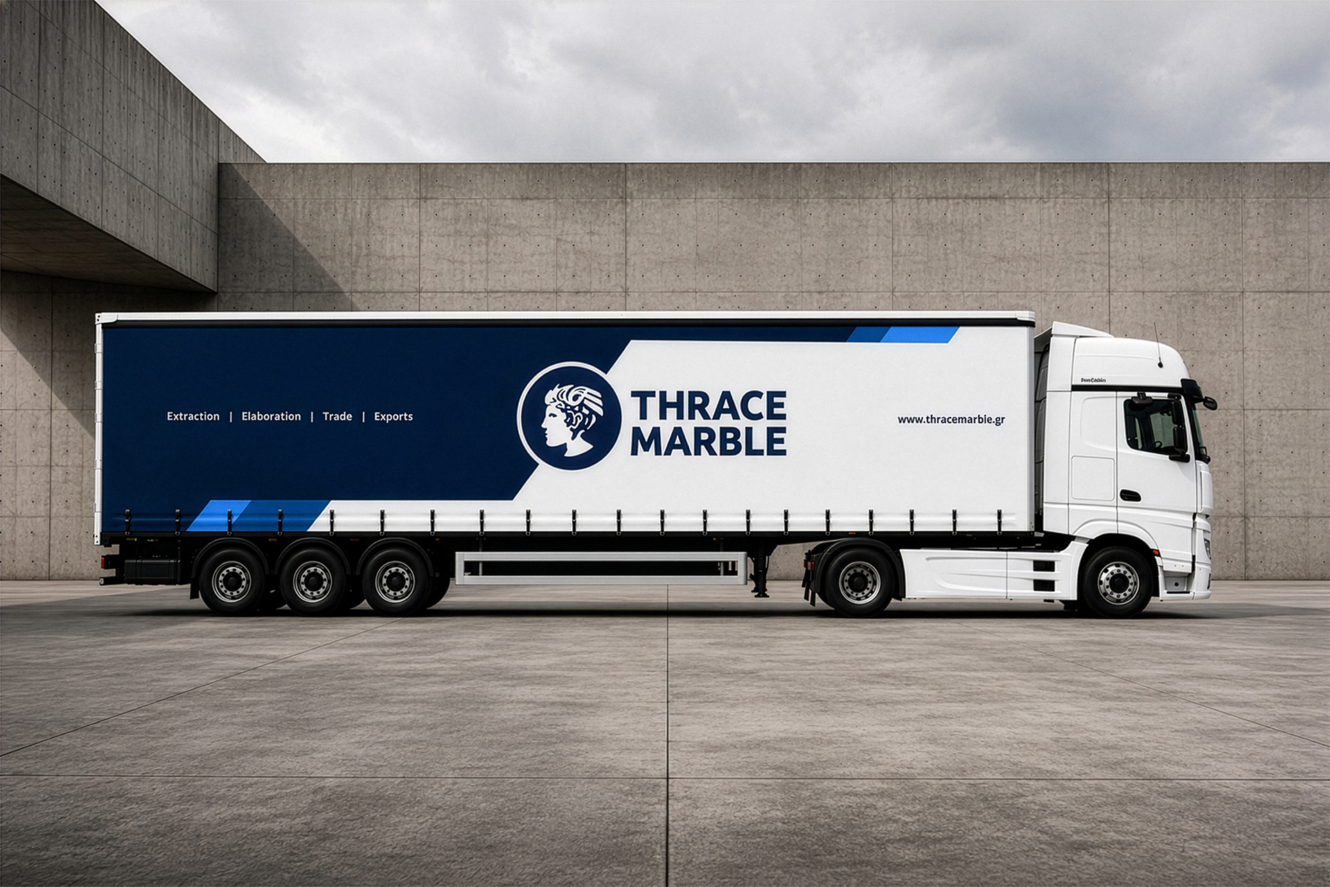
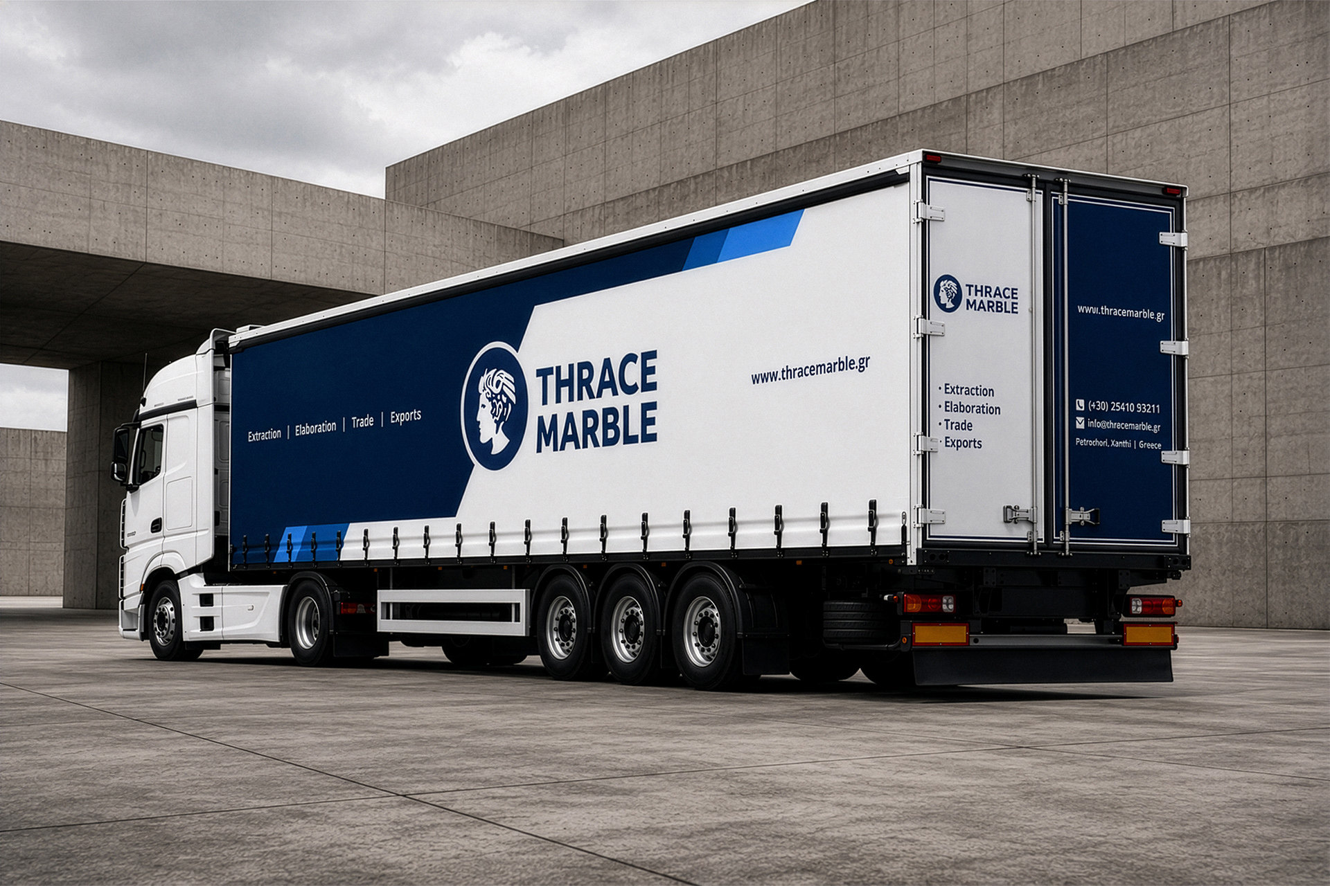
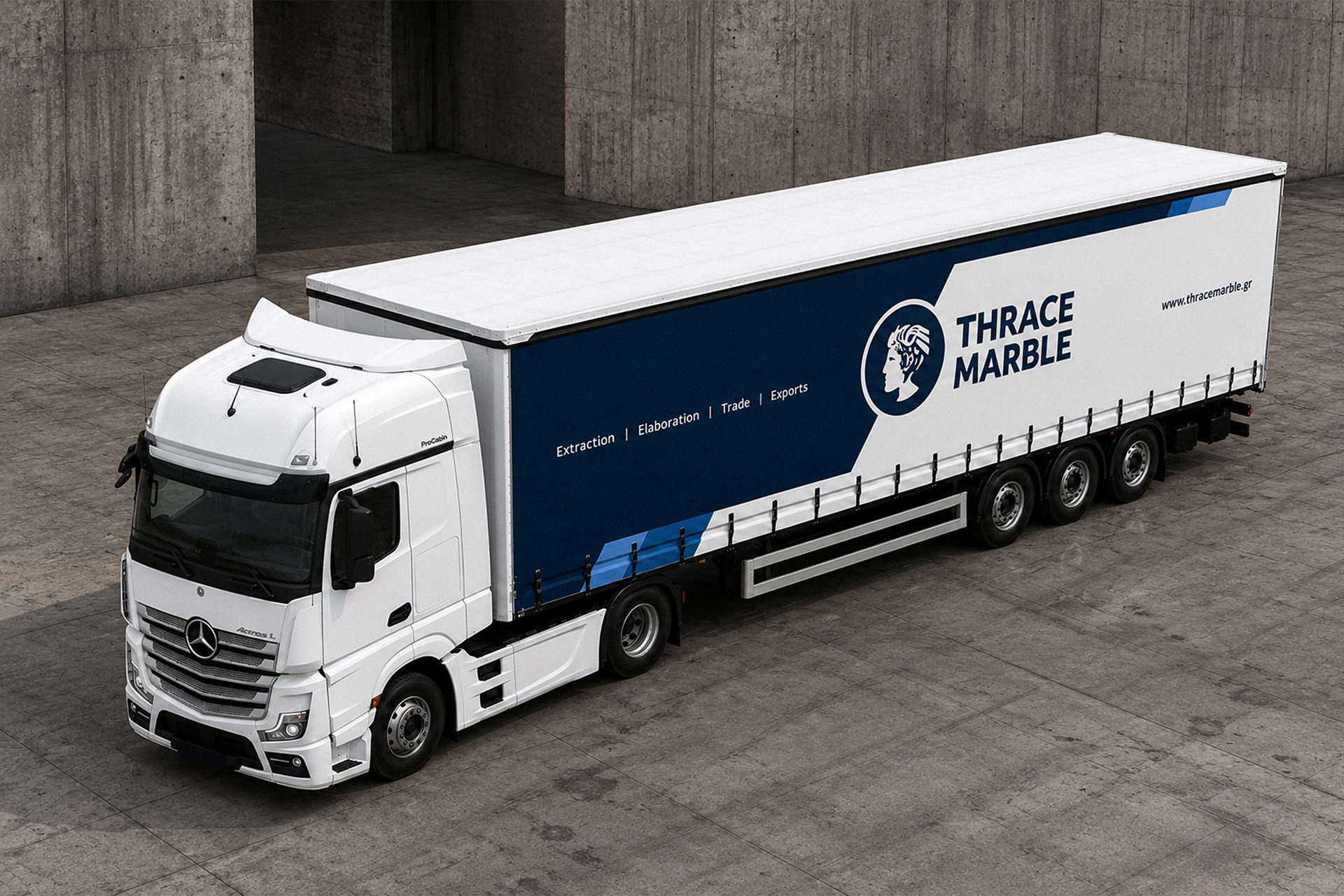
The vehicle branding for Thrace Marble was designed as a large scale application of the company identity on a professional transport vehicle. The main challenge was to make the truck work as a clear moving brand surface, while keeping the information readable from distance and in motion. The design uses the full length of the trailer as a structured visual field, balancing the company logo, name, website and activity descriptors with strong spatial control.
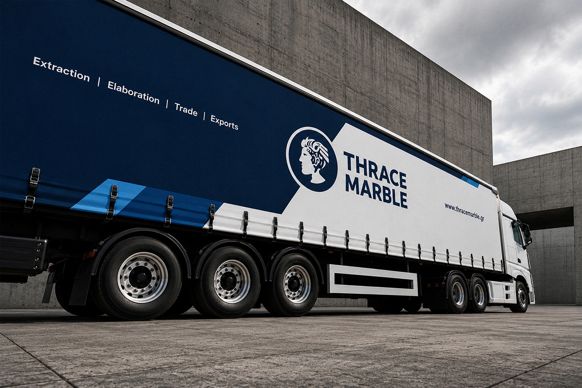
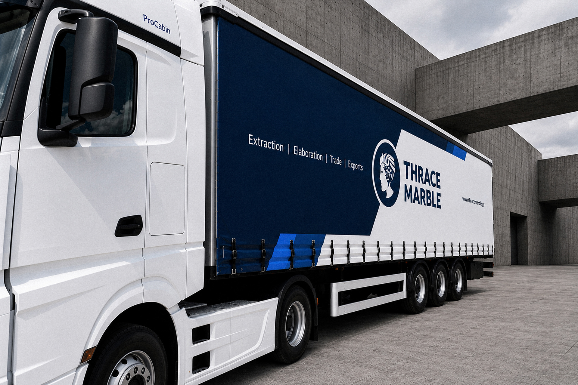
The graphic system is built around a direct contrast between deep blue and white. The blue area gives the vehicle weight, stability and corporate presence, while the white section creates clean space for the Thrace Marble logo and main identity elements. The diagonal transitions were designed to follow the length and movement of the trailer, adding direction without making the composition busy or decorative.
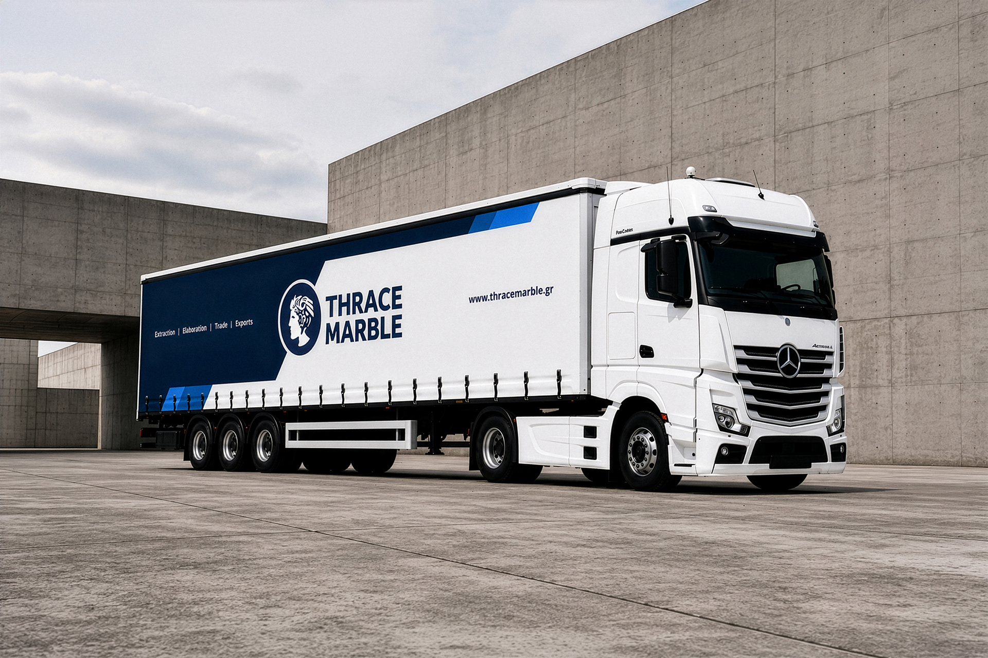
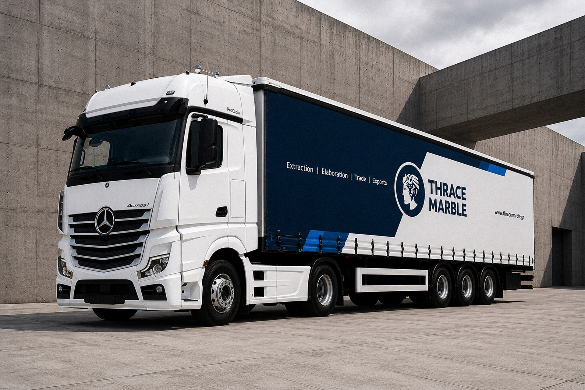
A key part of the design is that both sides of the trailer use the same graphic system, while each side creates a different visual relationship with the white truck cabin. On one side, the white area of the trailer connects visually with the white cabin, creating a more continuous and unified surface. On the opposite side, the white cabin is followed by the deep blue printed area, creating a stronger contrast and a more immediate visual break. This gives the same identity system two different readings, while keeping the brand language consistent.
Every element was placed with the real proportions of the vehicle in mind. The logo scale, the position of the website, the horizontal service line and the rear door information were all treated as parts of one consistent identity system. The result is a truck branding design that feels solid, readable and professional, turning a transport vehicle into a strong visual extension of the Thrace Marble brand.
Ο σχεδιασμός του εταιρικού οχήματος για τα Μάρμαρα Θράκης δημιουργήθηκε ως εφαρμογή της εταιρικής ταυτότητας σε μεγάλη κλίμακα, επάνω σε επαγγελματικό όχημα μεταφοράς. Η βασική πρόκληση ήταν το φορτηγό να λειτουργεί ως καθαρή κινούμενη επιφάνεια brand, με πληροφορία που παραμένει ευανάγνωστη από απόσταση και ενώ το όχημα βρίσκεται σε κίνηση. Ο σχεδιασμός αξιοποιεί όλο το μήκος του trailer ως οργανωμένο οπτικό πεδίο, με ισορροπία ανάμεσα στο λογότυπο, την επωνυμία, το website και τις βασικές δραστηριότητες της εταιρείας.
Το γραφικό σύστημα βασίζεται στην άμεση αντίθεση ανάμεσα στο βαθύ μπλε και το λευκό. Η μπλε επιφάνεια δίνει στο όχημα βάρος, σταθερότητα και εταιρική παρουσία, ενώ το λευκό τμήμα δημιουργεί καθαρό χώρο για το λογότυπο και τα κύρια στοιχεία της ταυτότητας των Μαρμάρων Θράκης. Οι διαγώνιες μεταβάσεις σχεδιάστηκαν ώστε να ακολουθούν το μήκος και την κίνηση του trailer, προσθέτοντας κατεύθυνση χωρίς να φορτώνουν τη σύνθεση.
Σημαντικό στοιχείο του σχεδιασμού είναι ότι και οι δύο πλευρές του trailer χρησιμοποιούν το ίδιο γραφικό σύστημα, αλλά κάθε πλευρά δημιουργεί διαφορετική οπτική σχέση με τη λευκή καμπίνα του φορτηγού. Στη μία πλευρά, η λευκή περιοχή του trailer συνδέεται οπτικά με τη λευκή καμπίνα, δημιουργώντας μια πιο ενιαία και συνεχόμενη επιφάνεια. Στην αντίθετη πλευρά, η λευκή καμπίνα ακολουθείται από τη βαθιά μπλε εκτυπωμένη περιοχή, δημιουργώντας πιο έντονη αντίθεση και πιο άμεση οπτική μετάβαση. Έτσι, το ίδιο σύστημα ταυτότητας αποκτά δύο διαφορετικές αναγνώσεις, χωρίς να χάνει τη συνοχή του.
Κάθε στοιχείο τοποθετήθηκε με βάση τις πραγματικές αναλογίες του οχήματος. Η κλίμακα του λογοτύπου, η θέση του website, η οριζόντια γραμμή των υπηρεσιών και η πληροφορία στις πίσω πόρτες αντιμετωπίστηκαν ως μέρη ενός ενιαίου συστήματος εταιρικής ταυτότητας. Το αποτέλεσμα είναι ένα truck branding design με καθαρότητα, αναγνωρισιμότητα και επαγγελματική παρουσία, που μετατρέπει το όχημα σε φυσική προέκταση του brand Μάρμαρα Θράκης.
www.id3a.gr
#id3a #vehiclebranding #truckbranding #thessaloniki #greece