
Design: Corporate Folder.
Client: ARCTIST.
Location: Thessaloniki / Hellas.
Date: September 2024.
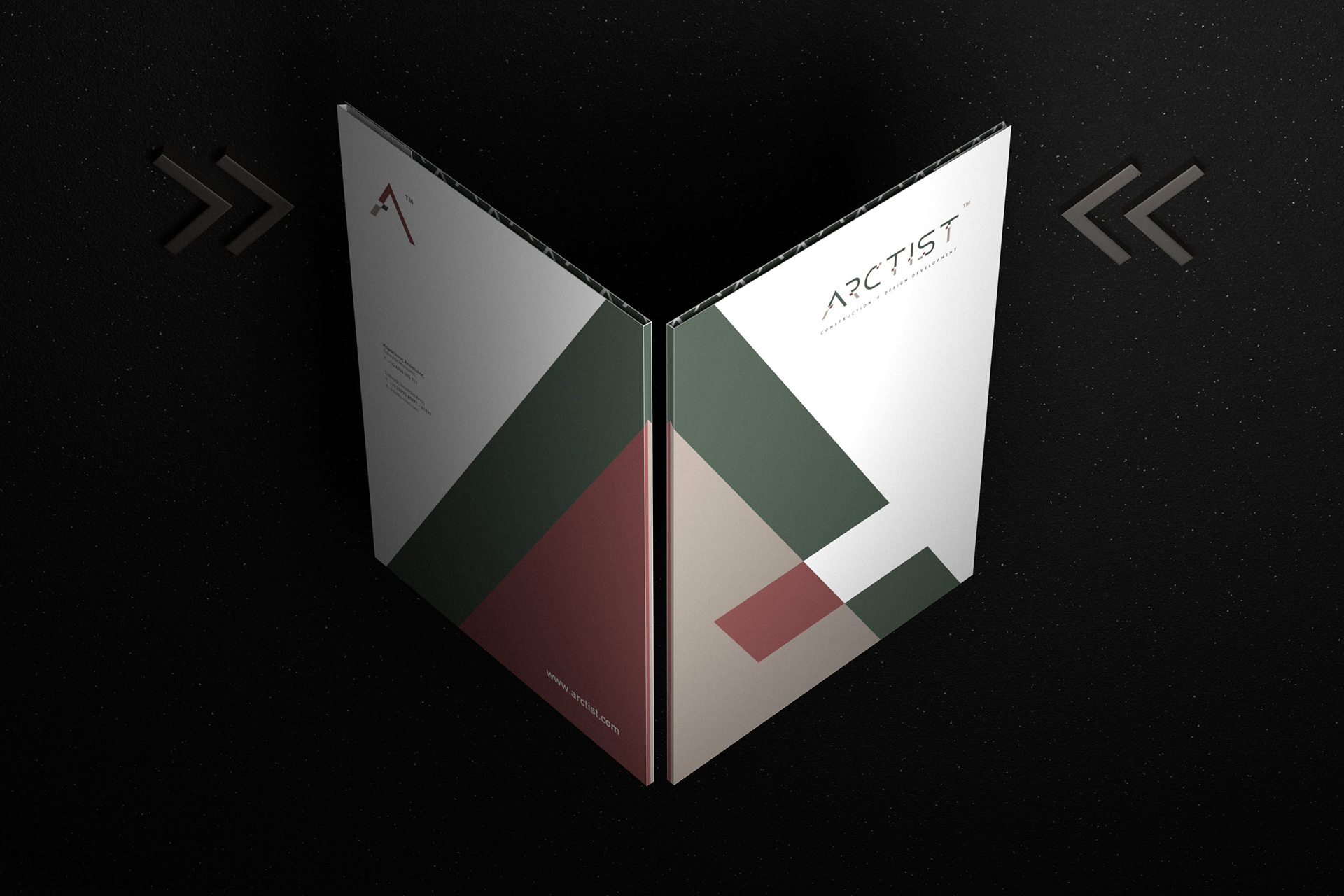
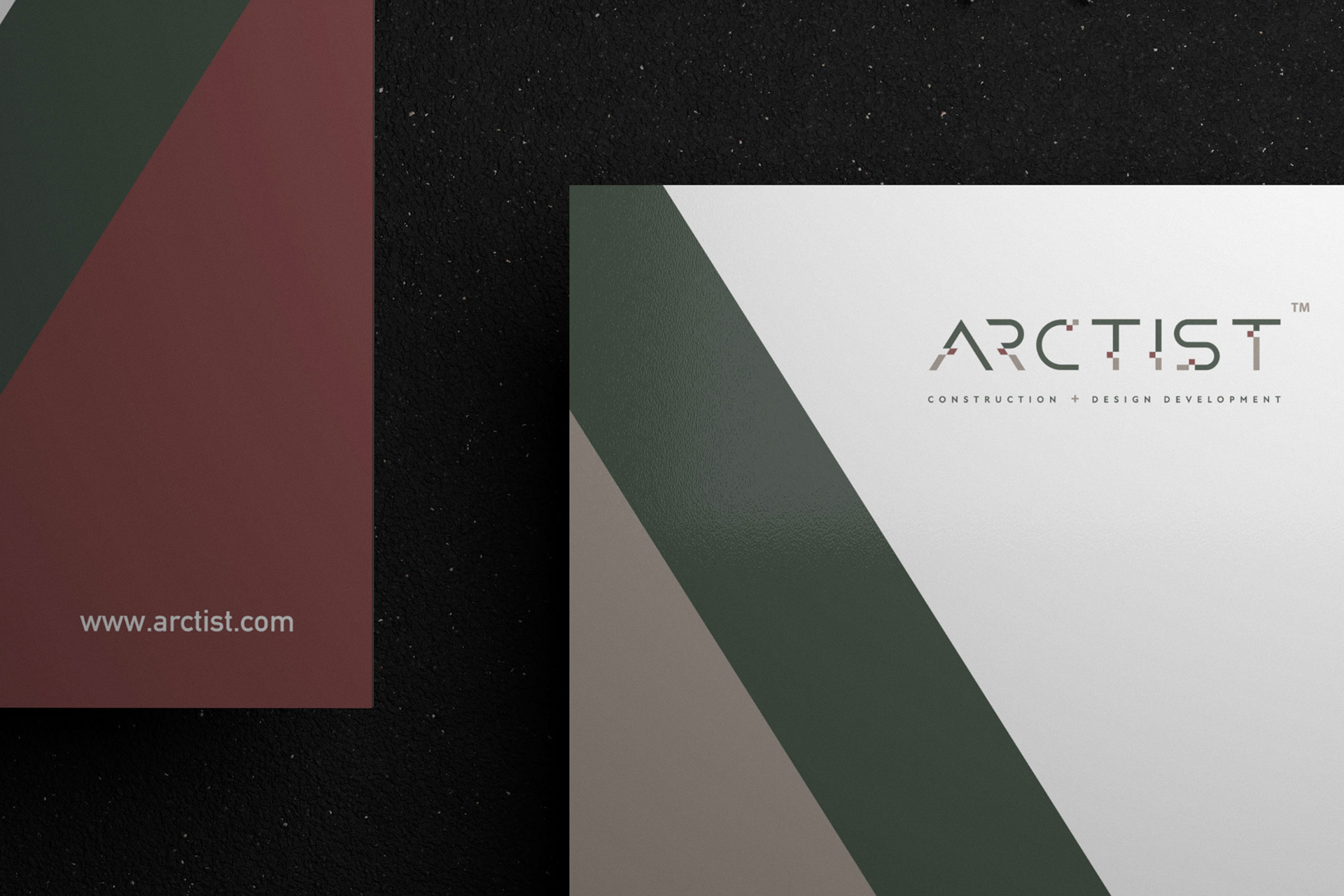
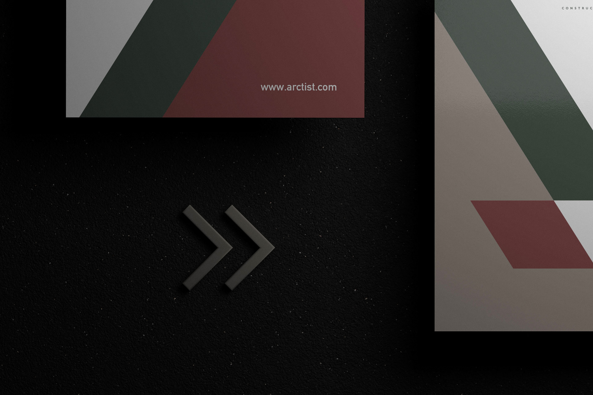
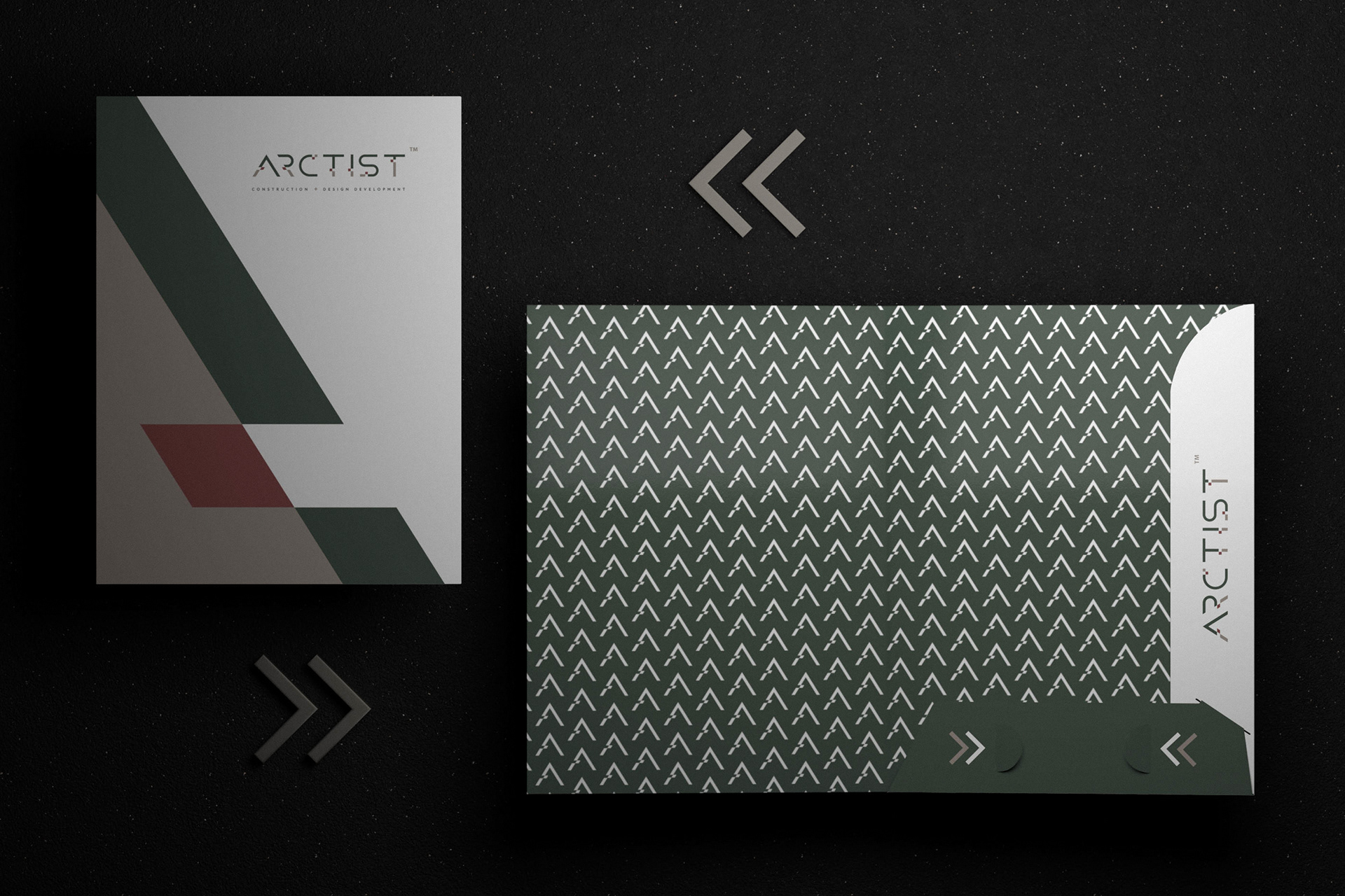
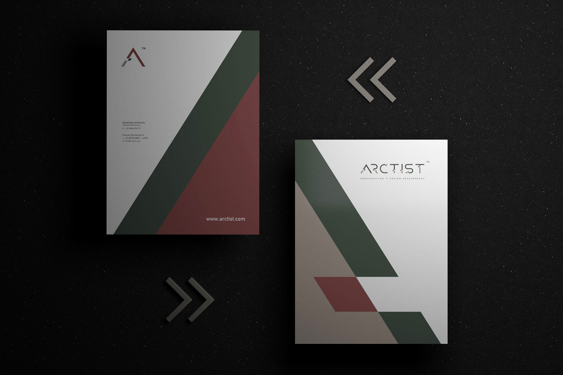
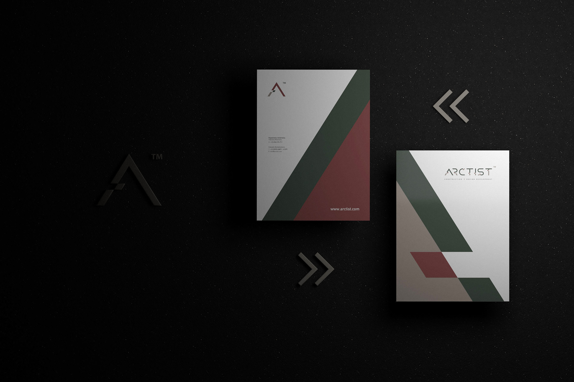
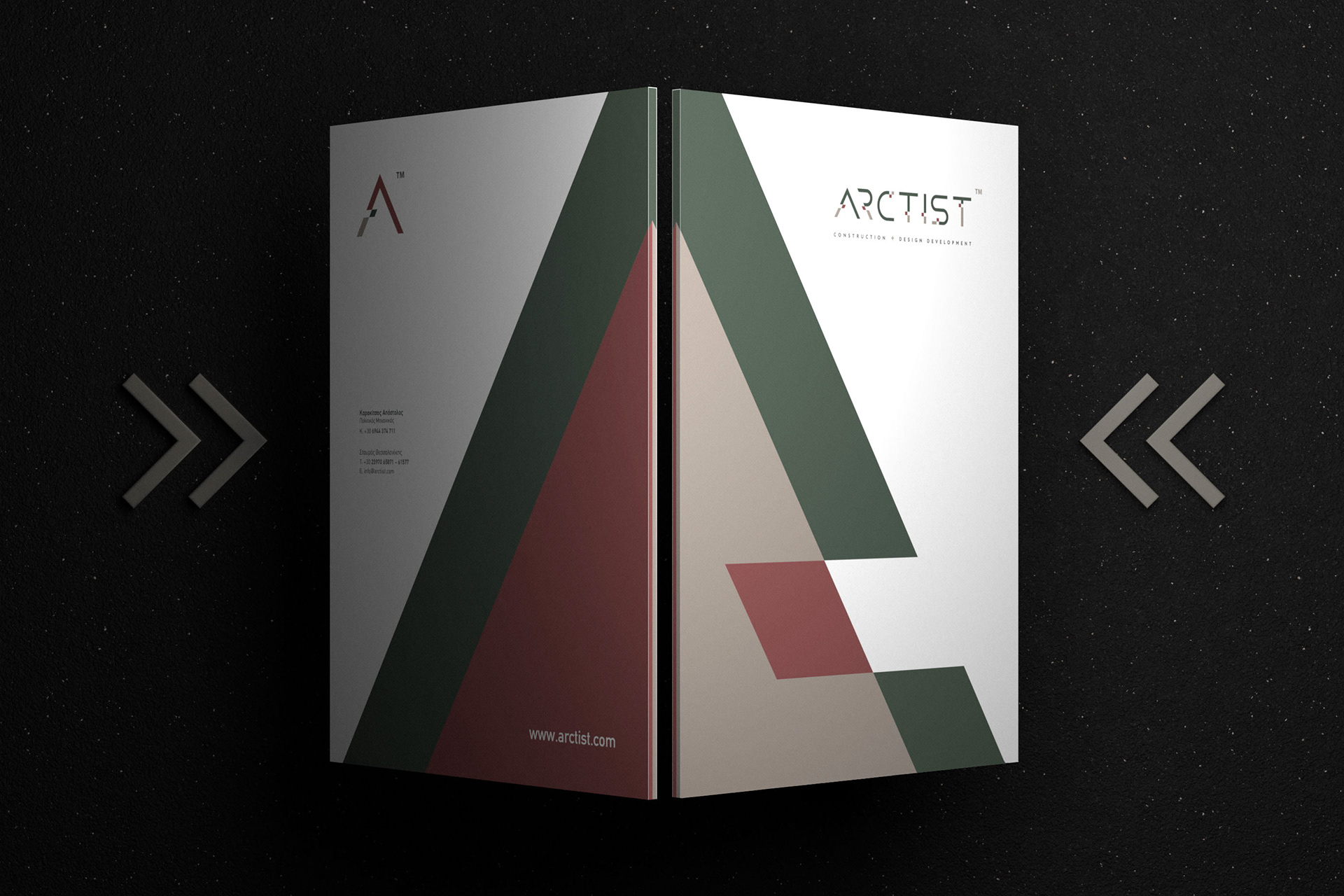
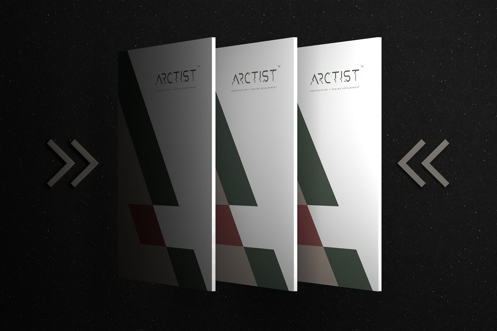
The corporate folder design for ARCTIST establishes a bold and sophisticated visual identity that reflects the studio’s architectural ethos of precision, innovation, and timeless aesthetics. Defined by sharp geometric forms and a muted, earthy palette, the design conveys structure, balance, and contemporary elegance.
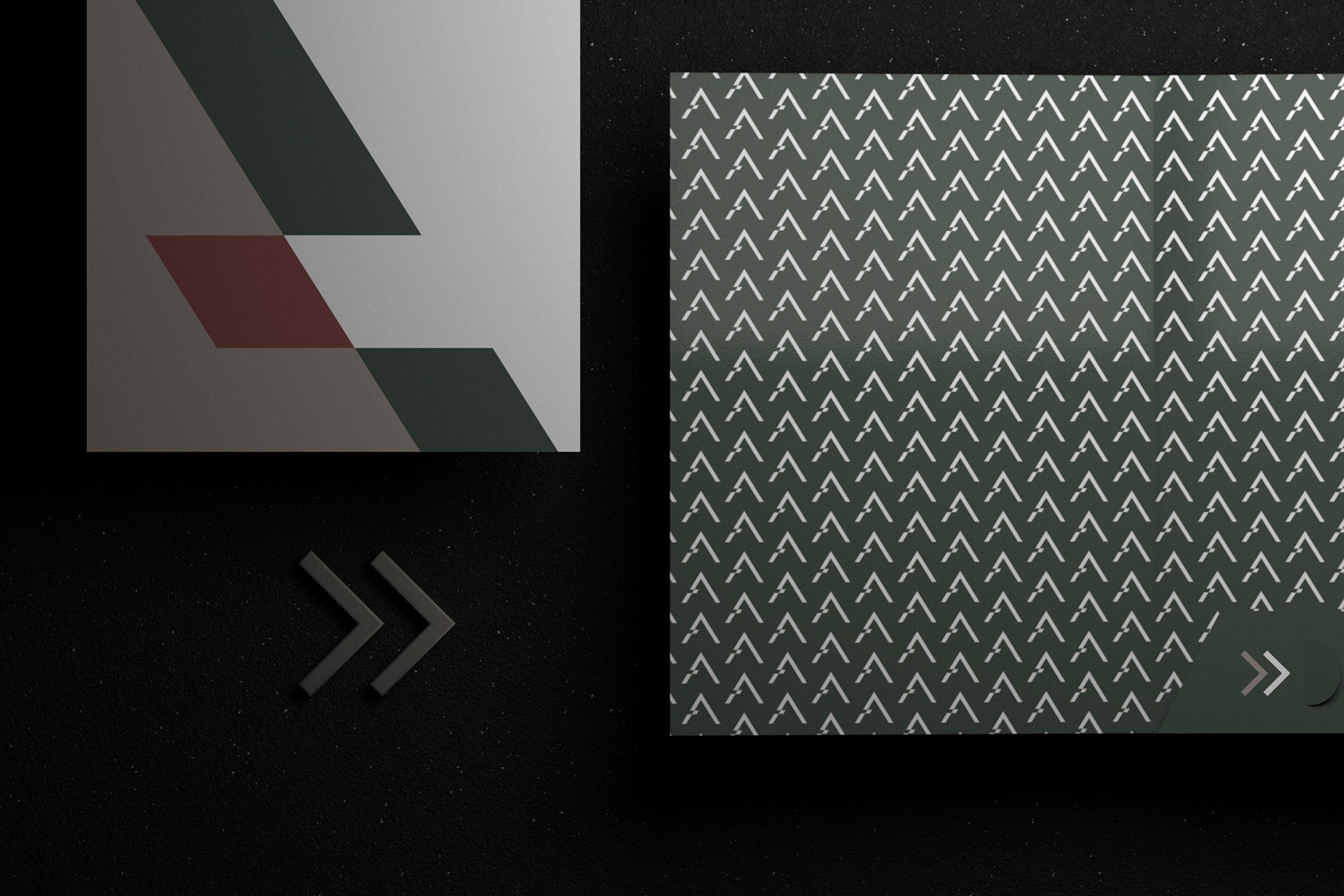
The interplay of deep green, muted beige, and warm brick red creates an architectural mood of stability, natural harmony, and refined creativity. The minimalist “A” symbol functions as both letterform and abstract structural element, while the internal monogram pattern introduces rhythm and continuity, echoing architectural repetition.
Typography, composition, and visual balance are carefully orchestrated to embody ARCTIST’s philosophy: clarity of thought, rigor in execution, and harmony in form. This identity piece resonates with clients who value thoughtful design, visionary spaces, and uncompromising quality.
Το εταιρικό folder για την ARCTIST αποτυπώνει μια τολμηρή και εκλεπτυσμένη ταυτότητα, που αντικατοπτρίζει τη φιλοσοφία του στούντιο: ακρίβεια, καινοτομία και διαχρονική αισθητική. Η σύνθεση βασίζεται σε αιχμηρές γεωμετρικές φόρμες και μια γήινη, muted χρωματική παλέτα, αποδίδοντας δομή, ισορροπία και σύγχρονη κομψότητα.
Ο συνδυασμός του βαθύ πράσινου, του απαλού μπεζ και του θερμού κεραμιδί δημιουργεί αίσθηση σταθερότητας, φυσικής αρμονίας και δημιουργικής φινέτσας. Το μινιμαλιστικό σύμβολο «Α» λειτουργεί τόσο ως γράμμα όσο και ως αφαιρετικό δομικό στοιχείο, ενώ το επαναλαμβανόμενο μοτίβο μονογράμματος στο εσωτερικό φέρνει ρυθμό και συνέχεια, παραπέμποντας στην αρχιτεκτονική επανάληψη.
Η τυπογραφία, η σύνθεση και η οπτική ισορροπία έχουν σχεδιαστεί με ακρίβεια ώστε να ενσαρκώνουν τη φιλοσοφία της ARCTIST: καθαρότητα σκέψης, αυστηρότητα στην εκτέλεση και αρμονία στη μορφή. Το folder αυτό λειτουργεί ως στοιχείο ταυτότητας που απευθύνεται σε απαιτητικούς πελάτες, οι οποίοι εκτιμούν το ουσιαστικό design, τα οραματικά έργα και την αδιαπραγμάτευτη ποιότητα.
#design #corporateidentity #branddesign #graphicdesign #id3a #greekdesign