

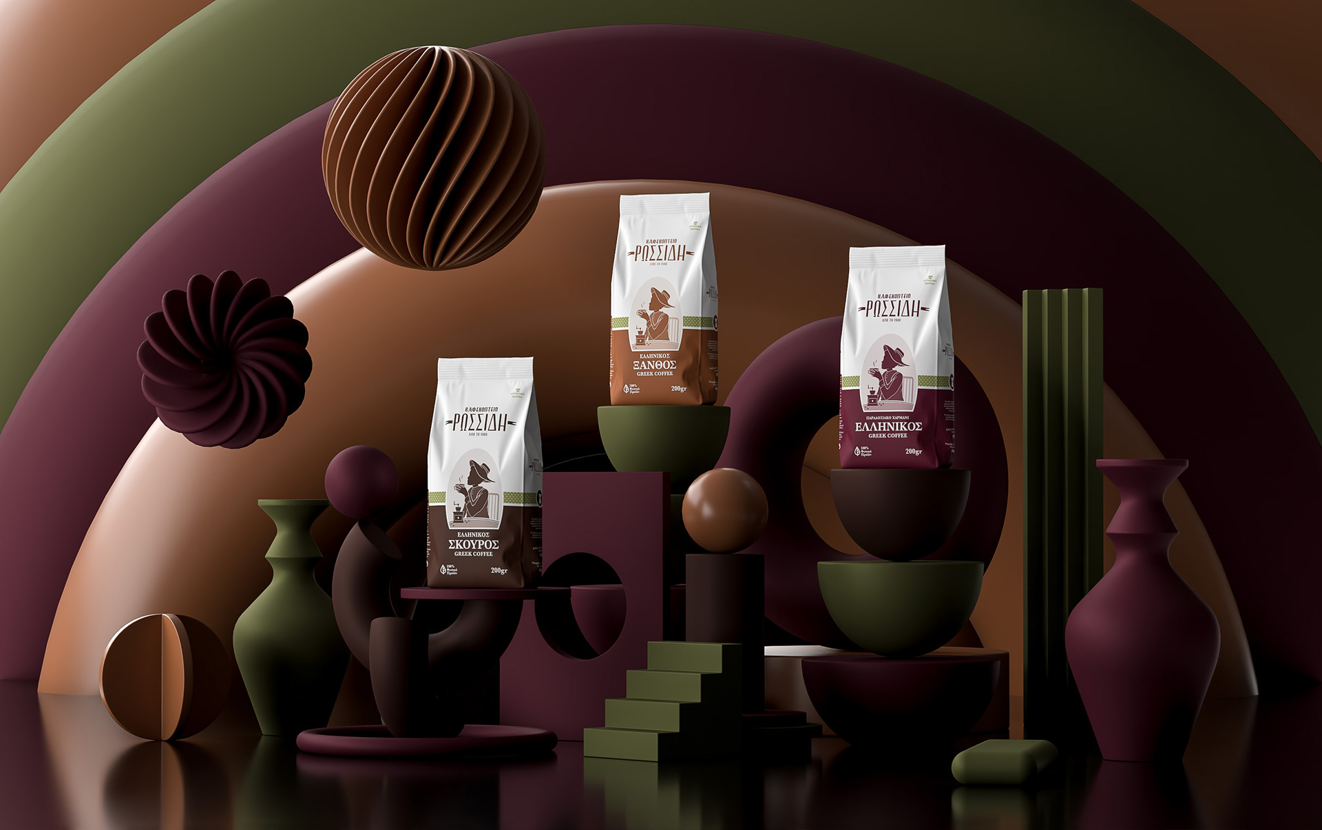
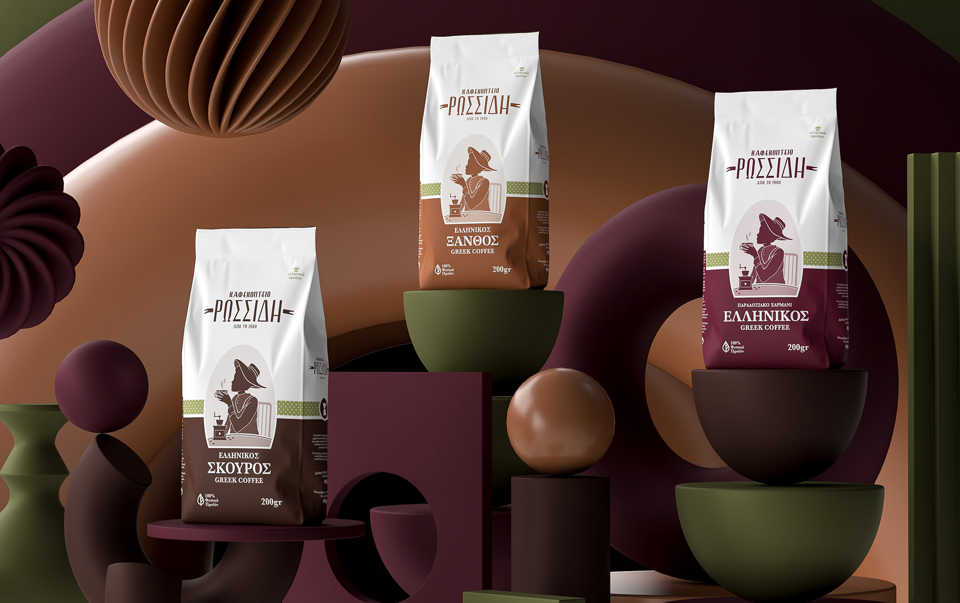


In this packaging series for Rossidis Coffee, we revisited the essence of traditional Greek coffee through a lens of visual restraint and typographic dignity. Our approach centered around the brand’s long-standing heritage — established in 1980 — and translated that legacy into a clean, modular system for its three core blends: Classic, Blonde, and Dark Roast.
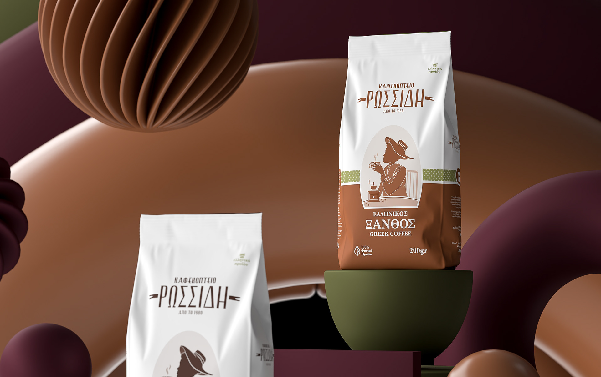
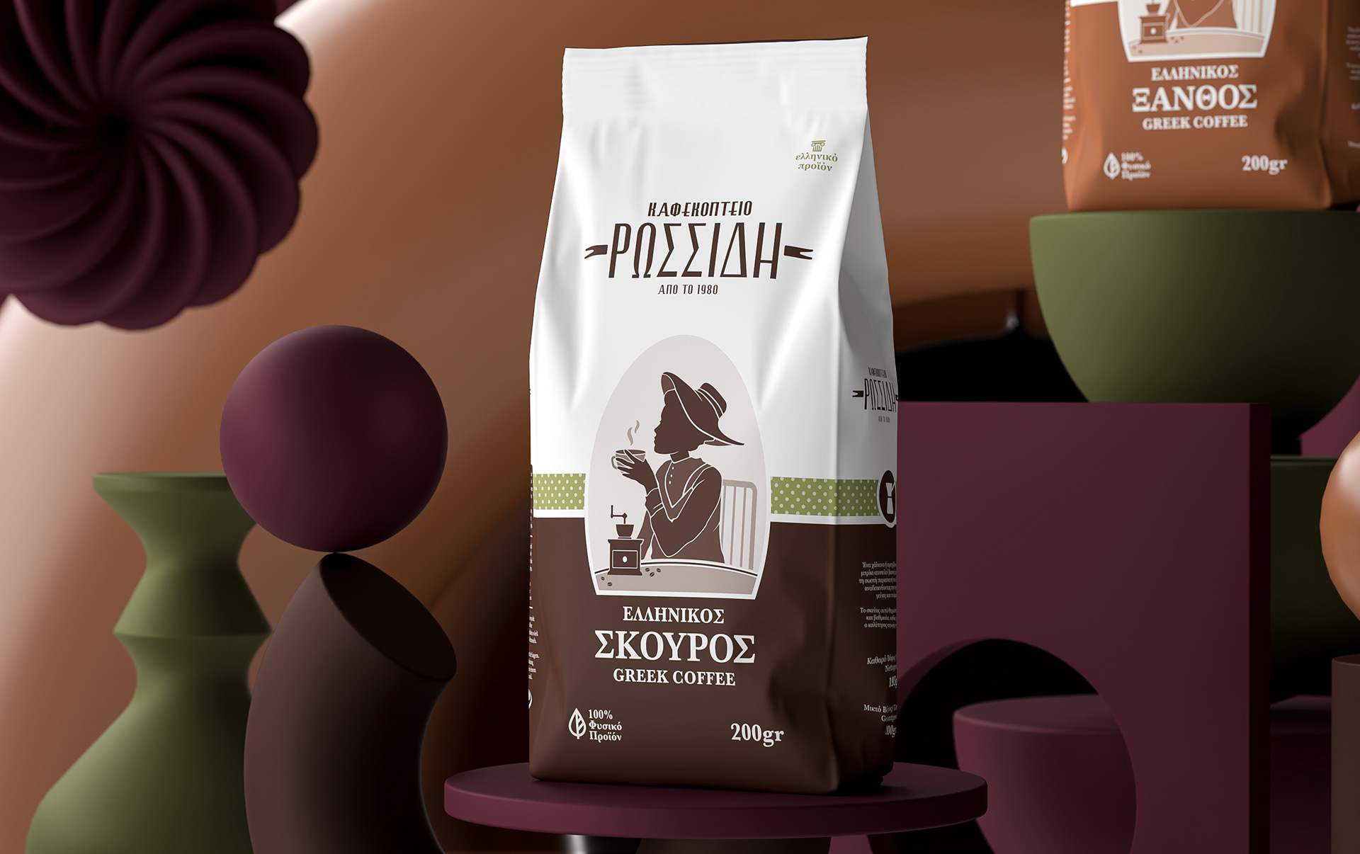
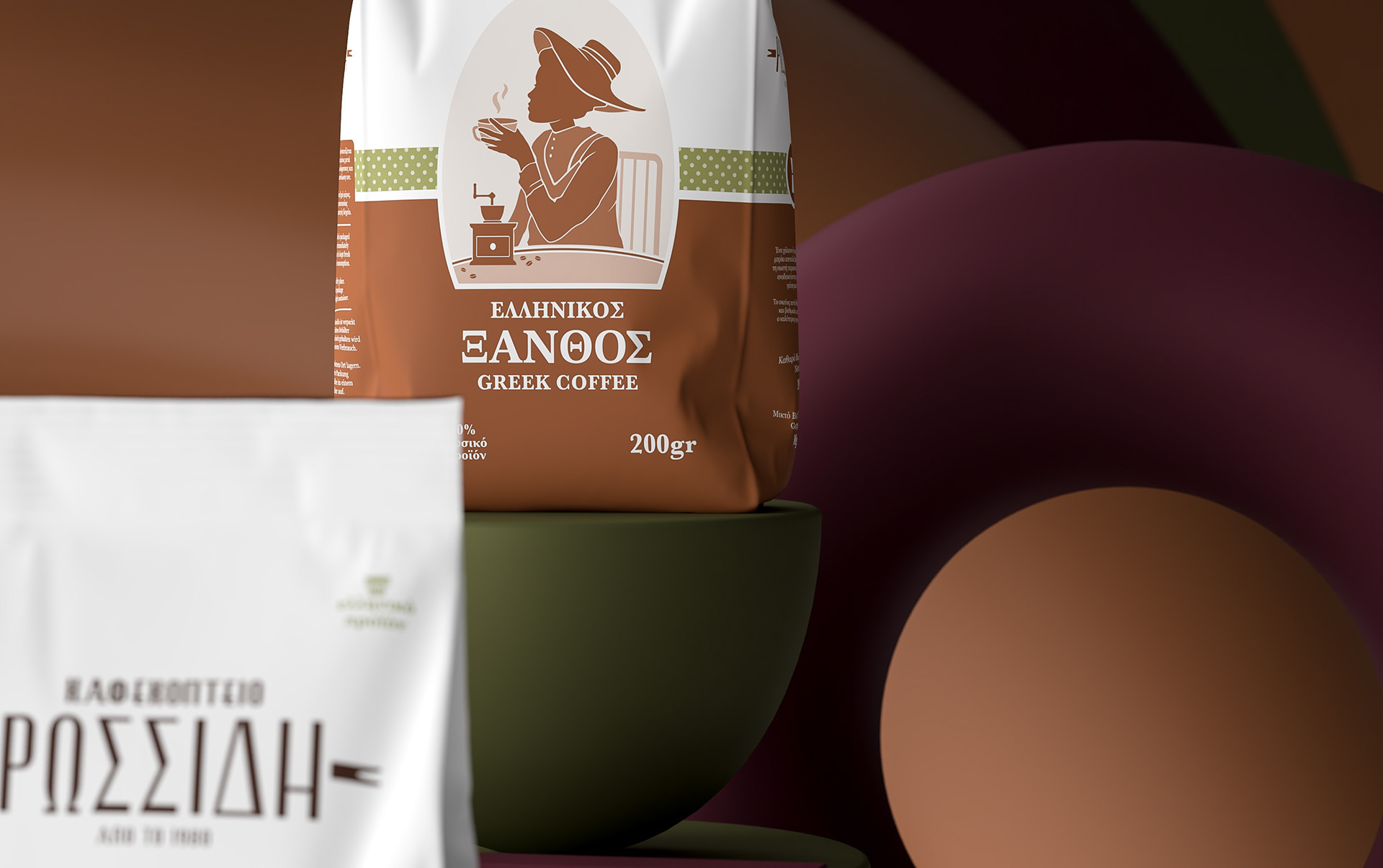
The central illustration — a silhouetted woman enjoying coffee — serves as a timeless symbol of Greek coffee culture. Stylized yet familiar, it anchors the identity while allowing room for chromatic differentiation across the variants. Each blend is distinguished by a dedicated color palette (burgundy, brown, ochre), ensuring instant recognition on shelf while retaining a cohesive family structure.
The design balances vintage familiarity with contemporary minimalism: serif typography for a sense of heritage and elegance, paired with geometric framing and a subtle dotted band that evokes tablecloth patterns of old cafés. The background setting — sculptural and abstract — was constructed to echo the sensorial layers of aroma, warmth, and tradition that define Greek coffee, all while elevating the brand’s visual hierarchy in a saturated market.